By Maggie North
Introduction
Isabel Bishop (American, 1902-1988) studied graphic arts at the School of Applied Design for Women before taking up painting at an artists’ colony in Woodstock, New York in the summer of 1919. Today, she is best remembered for her perceptive drawings, prints and paintings of women that entered the workforce in the decades following WWI. In her mature career, Bishop used drawing in preparation for painting rather than as an end in itself. However, her deep connection to drawing is evident across all media in her oeuvre. Even in her finished paintings, Bishop’s use of sketched contours and lines, seemingly incised on top of oil or tempera paint, add interest and emphasis to otherwise textural and atmospheric scenes. This results in an unexpected and unmediated relationship between figure and ground. While one critic who reviewed Bishop’s paintings in the 1930s noticed “clearly defined figures and faces,” another found that the figures were too “washed out to emerge.”[1] A drawing in the collection of the University Museum of Contemporary Art at the University of Massachusetts is a useful starting point from which to investigate the complex relationship between figure and ground in Bishop’s drawings and paintings. By blurring the figure-ground relationship, flattening planar space, and using drawing on top of painting, Bishop challenged the separation of media and media hierarchies promoted in academic teaching. Bishop’s unorthodox engagement with traditional techniques, preference for modern subjects in ambiguous settings, and progressive rejection of both gender hierarchies and hierarchies of media promoted by academic art, all allowed her to challenge the conventions of drawing and painting in the early 20th century.
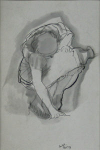
Figure 1: Isabel Bishop, Bending Down, 1945, Ink wash on paper: 6-1/2 x 4 in. The University Museum of Contemporary Art at the University of Massachusetts Amherst, Amherst, Massachusetts. Purchased with funds donated by Gloria Russell, Wilbraham, MA and the Monsanto Matching Gift Fund in memory of Art History Professor, Iris Cheney, UM 1997.1.
In the UMCA drawing titled Bending Down (Figure 1), a woman bends down, perhaps to pick up an item that was dropped. In this crouched position, her limbs become compressed and her body takes on a blocky shape. The artist is able to capture her form from a mix of perspectives: her legs, knees, and arm are seen from the side, but her shoulders and head are visible as if from above. The drawing is far from cubist, but Bishop does display a typically cubist interest in flatting space and complicating planar relationships. Here, the head of the woman becomes a near circle and her torso a near rectangle. The geometry is inherent in the pose, but the planar distinctions are further mystified by Bishop’s generous use of an ink wash. The wash is used to tint and pattern the woman’s hair and dress, but also to create an aura that radiates around the figure. The brushstroke of wash that surrounds the figure does not function like a shadow or an outline; rather it signifies background and atmosphere. In an extremely close look at the piece, the keen observer will notice that some of the darker ink lines (especially on the figure’s left leg) have bled into the wash, indicating that ink was used both beneath and on top of the washed layer. The subject’s unusual pose and Bishop’s use of shading flatten the space, creating a dynamic push and pull between figure and ground, foreground and background. Within this ambiguous atmosphere, Bishop’s use of varied lines, applied at multiple moments in the process and in varied widths, help the viewer to differentiate the figure and to identify hints of shadow and contour.
In addition to its layers of visual interest and noteworthy figure-ground relationship, the UMCA drawing represents the subject matter for which Bishop is most known. While living in and working in New York City, Bishop was one of several artists who depicted new women of the era. Along with Raphael Soyer, Reginald Marsh, and others, Bishop became interested in capturing the daily lives of independent, working women. However, when Bishop arrived in New York City, the phrase “new woman” was not new. At the end of the 19th century, the phrase had been used to describe educated women who often left their homes to work, advocated for gender equality, and embraced a place in society among men.[2] By the 1920s and 1930s, America’s social order continued to evolve. As the country responded to the tragedies World War I and the Great Depression, the nation’s collective needs gained importance and individualism in America waned. The new woman of the subsequent decades was a working woman who embodied a new sense of independence, but was not necessarily highly educated or politically active. Of course, each woman’s experience was distinctive and these generalities exist in order to explain a greater trend. As Ellen Wiley Todd Describes in her book The “New Woman”: Painting and Gender Politics on Fourteenth Street, “The New Woman of the 1920s and 1930s was a moderate sort, hoping to capitalize on new job possibilities and to make herself attractive with the mass-produced products of the clothing and cosmetics industry.”[3] As Todd points out, an increase in middle class wealth and consumption characterized the 1920s and new jobs emerged with modern industries. The new women that Bishop commonly sketched were shop girls, secretaries, and office workers that walked or lunched around Union Square. In Bishop’s images, they’re seen in the midst of putting on their coats, fixing makeup, talking with one another, or simply bending down. In tandem with American Scene Painting of the 1920s and 30s, a movement that aimed to depict average people and places, Bishop and her contemporaries made these new women (shoppers, shop girls, and office workers) the subject of American fine art for the first time.
Creating the “Seamless Web”
A discussion of Bishop’s education and working practice illuminates the way the UMCA work fits into the artist’s career and the role that drawing played in Bishop’s practice. Like many artists that came before her, Bishop executed numerous preparatory drawings. Typically, she sketched her subjects, then created prints inspired by previous sketches. She even made photostatic reproductions in a number of sizes in order to choose the size that was best for the final painting. She once lamented, “It bothers me when I am praised predominantly for drawings or prints, since for me, the end was painting. All the rest was leading to painting.”[4] The final painting was a labor of love and typically took at least several months to complete. Although no known painted version of the UMCA sketch exists, a series of sketches related to the painting At the Noon Hour (Figures 2 and 3) offer some insight into Bishop’s consideration of atmosphere and application of line at each stage in her process. One of what must have been numerous preparatory sketches, Study for Noon Hour #1, is rendered with spontaneity and attention to the figural form. However, as in Bending Down, an ink wash has been applied to the background, alluding to, but not detailing, a sense of air or space around the figures. In the etching, the figures become more defined, but by the final painting, they again experience a tension between nearly blending into the background in some sections of the drawing and standing out from it in others. The painting At the Noon Hour (Figure 4) is exemplary of Bishop’s approach. The ground has been worked and reworked and evidence of layering is visible. While certain elements of the women’s clothing, heads and hands are outlined quite boldly, other elements of the drawing nearly fade into the background. The facial features of the woman on the right benefit from this contouring, but the hat of the woman on the left nearly disappears.
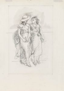
Figure 2: Isabel Bishop, Study for Noon Hour #1, circa 1935, Ink, pencil and wash on paper: 13 in x 10 3/4 in. Mount Holyoke College Art Museum, South Hadley, Massachusetts. Gift of the estate of Eileen Paradis Barber (class of 1929), MH 1997.14.7.

Figure 3: Isabel Bishop, Noon Hour, 1935, etching: 6-7/8 x 4 7/8 in. Smithsonian American Art Museum, Washington D.C., Museum purchase, 1973.26.

Figure 4: Isabel Bishop, At the Noon Hour, circa 1936, tempera and pencil on composition board: 25 x 18 in. Michelle and Donald D’Amour Museum of Fine Arts, Springfield Museums, Springfield, Massachusetts, 39.01.
Isabel Bishop’s unusual approach to drawing and painting was shaped by an internalization of some aspects of her artistic training and a staunch rejection of others. When she joined the Art Student’s League in New York, Isabel Bishop studied foundations of proportion, perspective, sculptural volume and plasticity in realistic painting with Kenneth Hayes Miller. Miller embraced the academic tradition, and although he painted modern, urban scenes he was invested in the renaissance-era methodology of creating balanced compositions and rendering figures with a rounded, sculptural quality.[5] In his teaching, Miller adhered to many typical academic traditions that were established by European Academies in the 16th through the 19th century. These academies established a strict and regimented way of learning to make art. Before students were allowed to practice the high art of painting, they were required to master the basics of drawing. Life drawing classes were essential to this art education, and they too were hierarchical. A student would start by drawing from a skeleton, then draw from a cadaver, eventually working his way up to the live model.[6] In the presence of the model (who was typically male and nude), the most advanced students had privileged seats, while new students had to sit awkwardly close to or far away from the model.
With Miller, Bishop would have learned traditional drawing techniques like modeling and foreshortening. Since the Renaissance, and certainly in European academies, visually accurate portrayals of foreshortened bodies were a mark of excellent training, and could even be achieved using a gridded perspective tool or simply an academically trained eye.[7] Bishop’s complicated relationship to foreshortening and depth is typified in Bending Down and At the Noon Hour. In both works, she easily captures the gestures of her sitters, but she does not engage in the exaggerated or braggadocio display of technical skill that was typical of academic exercises in foreshortening. In fact, Bishop refuses to create a believable sense of depth beyond the limited amount of space that her figures, themselves, occupy. She was not interested in backgrounds that appeared to recede into space with great clarity.
From her training with Miller, Bishop acquired the skills needed to capture figures from a multitude of vantage points and depict figures on the go, but she rejected the often rigid or unnatural poses typically executed in life drawing classes. Constantly striving for a sense of motion in her work, Bishop plucked models from her neighborhood and asked them to pose based on sketches that she had completed in and around her Union Square studio. The goal was always to create images that did not appear posed. Bishop even hired carpenters to recreate lunch counters and benches so that she could replicate those captured moments. Discussing motion in her work, Bishop stated, “I was fascinated with the aim to express the possibility of change. I said to myself, ‘Could she move?’ and hoped for an affirmative answer.”[8] Bishop also asked models to walk back and forth, creating movement of their own accord. [9] In so doing, she freed her models as well as her art from rigid academic standards.
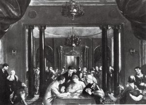
Figure 5: Isabel Bishop, Showing the Misunderstanding of Kenneth Hayes Miller’s Teaching by one of his Pupils, circa 1925: Medium and size unknown, painting destroyed. From: Helen Yglesias. Isabel Bishop (New York: Rizzoli International Publications, Inc., 1998), 13.
Additionally, Bishop cast off what she deemed “finished, finished things.” In a later commentary on her early work completed under Miller’s instruction, she stated, “I slashed them! Why they were terrible […] I worked on these things and I worked on them, and they were finished, finished things. They were completely off track.”[10] This fascinating statement clarifies Bishop’s preference for works that are unfinished, a descriptive term that is applied to drawing far more often than painting. An interesting work which is now destroyed and only exists through photographs, but may have been completed around 1925, speaks to the “finished” quality of work that Bishop later renounced (Figure 5). Posthumously titled Showing the Misunderstanding of Kenneth Hayes Miller’s Teaching by One of His Pupils, the piece features receding planes, compositional symmetry, formal harmony, and depth reminiscent of Raphael’s famous Vatican fresco The School of Athens. The gleaming chandeliers and reflective mirror also recall the illusionism and attention to detail that impresses any viewer of the Arnolfini Portrait by Jan Van Eyck. Bishop’s reference to these classically executed masterpieces, and paintings done in their image, must have been intentional.
Importantly, though, Bishop’s rejection of finished, illusionistic painting did not occur in a vacuum. She was influenced by the major changes in the definition of art that occurred in the 19th and early 20th century. In the 19th century, numerous artists contributed to the collapse of illusionistic, finished painting as the standard in western art. Notably, the early Impressionists of the 19th century created paintings akin to sketches by capturing light and mood in broad, abbreviated brushstrokes. Critic Louis Leroy accidentally coined the term impressionism by criticizing the paintings, dismissing them as mere “impressions” or sketches.[11] In the early 1900s, artists of the Ashcan School also rejected illusionism and finished artwork. The work of Ashcan Artists Robert Henri, John Sloan, and George Bellows adapted an abbreviated style and applied it to depictions of everyday people in urban environments, just as Bishop would. Additionally, although Bishop did not arrive in New York until 1918, the influence of the significant 1913 Armory Show was still in the air. This radical exhibition introduced Futurism, Cubism and other abstract art forms to the United States, contributing to the collapse of previously held expectations about art, including expectations about the figure-ground relationship.
Working in a transitional time, Bishop is indisputably a transitional figure. The modernity of her work is related to radical rejection of established norms, but is also grounded in an unconventional engagement with the past. Despite her rejection of painting’s “finish” in favor of an aesthetic closer to drawing, Bishop’s work is often described as having Baroque qualities. This has to do with the comparisons that have been made between modeling in her portraits and the round soft, humanistic, observational portraits of Rembrandt, as well as the shimmering subtleties of her layered and textured surfaces.[12] Bishop clarified the connection in her own words, stating, “it is hard to define […] but it is a figure-ground relationship. Everything I have tried to do is Baroque […] The essence of the Baroque style to me is its continuity, a seamless web. Examples of such continuity, in the form, are seen in Rubens’ sketches, in Renoir, Delacroix, Watteau.”[13] The word “continuity” is key to understanding Bishop’s work. There is, certainly, a sense of continuity between figure and ground, line and plane. The artist was striving to obtain this constant and dynamic push and pull through continuity. This Baroque comparison also has much to do with the fact that Bishop pulled select painting methods from the practices of Renaissance and Baroque art.
According to Karl Lunde, Isabel Bishop’s method of preparing canvas was largely inspired by Rubens and made available to the artist through the 1934 publication of a book that she purchased and read with great interest: Max Doerner’s Materials of the Artist. This book outlined traditional grounds, use of pigment and other painting techniques used since the Renaissance.[14] Most of Bishop’s paintings are completed on masonite, which was covered with up to eight coats of gesso, then layered with a ground of horizontal stripes of powdered charcoal and white lead, which created a transparent surface. The painting itself was composed of an under painting and a nearly transparent oil layer. In a further effort to create a dynamic environment for her figures, Bishop often added a supplementary layer of raw umber (the same color typically used in under painting) before engaging in further modeling of the figures.[15] In some instances, Bishop layered additional tones or vertical and horizontal lines in disorganized grids.[16] Amplified in her paintings, this technique of layering is similar to the layering of lines and wash in Bending Down. While the atmospheric background flattens space, Bishop’s use of line draws our attention to the figure.
The influence of the methods outlined in Doerner’s Materials of the Artist must have had a major impact on Bishop’s work. Doerner could nearly have been discussing Bishop’s paintings when he states:
The ground tone was preserved everywhere and drawn upon for the final effect; this gives to Rubens’ originals the harmony which is lacking in the products of the schools, in which, through too strong a covering of the half tones and shadows, and over modeling hard and gaudy effects are often produced.[17]
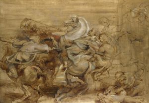
Figure 6: Peter Paul Rubens, A Lion Hunt, circa 1614-15, oil on oak: 30 x 41-1/2 in. The National Gallery, London, NG853.1.
However, Isabel Bishop embraced a more liberated approach to the overdrawing and layering than her predecessors. Rather than drawing on already established contours so as not to disrupt the illusionism of the scene, as Rubens typically did, Bishop engaged in overdrawing that is sketchy, uneven, and not restricted to contours, colors and planes. Sometimes, crosshatched or scribbled lines rather than modeling produce shadows and highlights in her paintings. As a result, Bishop’s final paintings are more similar to Rubens’ sketches than his finished works. They maintain the unfinished look that Bishop aimed to achieve. In Rubens’ A Lion Hunt (Figure 6) the artist’s process is visible and the work evokes the translucent layers and sketched contours that appear in Bishop’s paintings. Rubens’ final paintings are vibrantly colored and the palette is truer to life than Bishop’s low contrast color schemes. Bishop downplays the painterly use of color in order to reinforce line and form. She once stated, “color is not the original motif for me. My fundamentals are form, space and light.”[18] When color is used, it is commonly used to unite the surface with the subjects of her piece, to create an overall mood and atmosphere, as well as to create continuity between figure and ground.
This discussion of Bishop’s use of line, color, form, space, light can be better understood in relation to art historical associations with these elements of art. Heinrich Wölfflin famously described the principles of art in Principles of Art History: The Problem of the Development of Style in 1915. Wölfflin differentiated between “linear” and “painterly” styles, deeming the painterly to be more advanced. According to Wölfflin, the best and most painterly works nearly erased the preparatory line. He stated, “as soon as the depreciation of line as boundary takes place, painterly possibilities set in.”[19] Wölfflin probably would have been puzzled by Bishop’s atmospheric paintings, because the linear qualities are always visible, elevated above the paint. He may have also been confused by her sketch Bending Down, which complicates the linear and painterly relationship by conflating figure and ground. Wölfflin favored illusionistic, Renaissance artwork that contained planar depth, organized compositions, and appeared “finished” in the sense that no preparatory lines could still be visible. He elevated art that was “painterly,” and therefore deemed picturesque. Wölfflin’s value system helped solidify a strict hierarchy of media that was established in art academies and privileged painting over drawing. Even though Bishop prepared her canvases like the Flemish Baroque artists that she admired and had an excellent grasp on proportion and movement, she intentionally rejected the “finished,” “painterly,” or “picturesque” look.” In doing so, Bishop defied the hierarchies of European academies and of Wölfflin in favor of atmospheric works that make use of line and drawing even in the final stages of painting.
Gender and the Question of Social Mobility
Bishop’s lack of finish rejects both the traditional hierarchies of media in the academy and the way those very hierarchies reflected the social exclusion of women. The first academy was an entirely male institution that was founded in Florence, Italy in 1563. Throughout art history, women had been barred from life classes, and therefore from the training which was commonly believed necessary for great art. Even in 1893, women studying at the Royal Academy were not allowed to draw from nude models.[20] By the time Bishop entered classes at the Art Students League in New York, she was permitted to engage in figure drawing, but the weight of these hierarchies and traditions would still have been in the air. Isabel Bishop was working at a time when gender roles were rapidly changing for her subjects and for her as an artist. Her status as an artist was qualified. She was viewed as a “woman artist,” in a different league than her male counterparts whose place in academic art had been established for centuries. Her rejection of academic methods in her art works, therefore, relates also to a broader rejection of the male-dominated academic structure.
Bishop further challenged the traditions of academy through the treatment of her subject matter. Scholarship on Bishop’s work often describes how she distanced herself from the overtly political work of her contemporary Social Realist painters, but her artistic agenda was progressive. Scholars and critics continue to find her depictions of women, especially working women, to be empowering. In her introduction to Isabel Bishop, Helen Yglesias excitedly describes the women that Bishop depicts:
They were mightily impressive. With that walk, and those books, they would make the world—and, not at least, the nursery—a better place. The truth would set them free and their liking for lifelong perambulation would keep them well. There were young men in those images too. How lucky they were to walk in the same country, the same city and the same street as those direct, upright, well-oriented women![21]
Yglesias also states that even the figures in Bishop’s small works “are powered with vitalizing and towering humanity.”[22] The working women whom Bishop depicts were participating in job opportunities newly available to women in the decades following World War I. These women’s independence from domestic duties, and simply their ability to physically move about at their own will was worth documenting. Isabel Bishop was not the first to depict independent women in urban environments, but she did so with remarkable intimacy, intuition and command. Her instructor, Kenneth Hayes Miller, and contemporaries such as Raphael Soyer and Reginald Marsh also captured images of new women in New York City. However, the major difference between Bishop’s new women and the new women drawn and painted by her male contemporaries Raphael Soyer and Reginald Marsh was Bishop’s eschewal of a sexualized male gaze.

Figure 7: Reginald Marsh, Three Girls on a Subway Platform, 1930, etching:10-1/16 x 7-7/16 in. Metropolitan Museum of Art, New York, New York. Gift of the Honorable William Benton and Mrs. Felicia Meyer Marsh, 1956, 56.508.13. © 2018 Artists Rights Society (ARS), New York.
Compare Bishop’s sketch for At the Noon Hour to Marsh’s Three Girls on a Subway Platform of 1930 (Figure 7). In Marsh’s etching the women are not necessarily posing, but their bodies are conveniently angled towards the viewer. Each woman is busty, and her clothing clings to her. One woman pops her hip outwards in a posture that emphasizes her figure. Marsh’s women, though standing as a group, do not interact with one another. They appear to be waiting on the actions of an outsider or attending to Marsh’s male gaze. In contrast, Bishop’s women stand naturally, wear fairly loose fitting clothing and are clearly engaged with one another: they are seemingly unaware of the viewer. The women in Bishop’s drawings and paintings, like the woman in the UMCA’s Bending Down, seem to go about their day nearly unnoticed. In Bending Down, the subject’s sexual anatomy is not on display for the viewer. In fact, it is mostly hidden and her body is made blocky rather than curvaceous by her pose. The woman depicted likely intended this modesty. Her bending pose is typical of a woman wearing a skirt or dress, rather than a man wearing pants: instead of bending at her hips and risking her skirt flying up behind her, the figure bends her knees. Bishop seems to have been more interested in the complexity of form and interesting shapes created by this modest posture, rather than in creating a sensual image.
In her book The “New Woman” Revised: Painting Gender and Politics on Fourteenth Street, Ellen Todd argues that unlike Marsh, Bishop creates space for a female viewer, or at least for a gaze that is not sexually interested in the figures. Bishop created numerous works that depicted exchanges between women. Todd argues that the female viewer (or, we could say the female-identifying viewer) would feel more readily included in these scenes than the male viewer. Importantly, Todd also discusses the relationship of Bishop’s atmospheric backgrounds to the changeable and blurry social standing of her female subjects. Todd argues that the “fluidity of Bishop’s surfaces” (or the figure-ground relationship) pull the subject away from the traditional confines of domestic life and into a upwardly mobile, but still ambiguous atmosphere. Though she never declared that she was a feminist, Isabel Bishop did express interest in the social mobility of her subjects. The artist linked their physical mobility to economic and social class when she stated, “But what I feel about them [her office girls]—and I really do feel strongly about these things—is that I know so many instances where if they want to move, in a social sense, they can.”[23] Additionally, Todd astutely points out that the early reception to the atmospheric qualities of Bishop’s work was often divided along gendered lines: female critics praised the works for being clearly defined, unconventional and strong while male reviewers found the work to be washed out or timid.[24]
Todd’s lucid overview of the economic and social situation of the working women that Bishop depicted demonstrates the real limits that were placed on women’s social mobility. For Todd, these limits add to the tension and ambiguity in the work. Todd explains that the women Bishop sketches in Union Square are mostly office workers who have access to social mobility, but only so much. Most of these women worked at entry-level office jobs. Although they had the potential to be promoted from stenographer to secretary, most were expected to leave the workplace in favor of marriage by their mid-20s.[25] Polls from the 1920s indicate that women preferred marriage to working, and at the time, the two were considered to be mutually exclusive.[26] Women were paid far less than men, and when the depression hit wages and hours only worsened. In the 1930s, one survey showed that 88% of office managers wanted to hire employees who were not looking for a promotion. [27] In fact, many women at this time were encouraged to define themselves from a position of deference. In order to excel in the workplace they were expected to be subservient, demure, and pleasant, even when completing menial or boring tasks. Todd states that in the 1930s and 1940s, a woman’s clean and attractive appearance was actually cited, by employers, as a qualification for hiring.[28] The young women that Bishop depicted were expected to dress fashionably and to look the part for their jobs. Therefore, their grooming and dressing was not performed only for themselves, but also for the men who employed them.
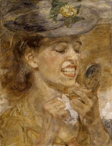
Figure 8: Isabel Bishop, Tidying Up, 1941, oil on masonite: 15 x 11-1/2 in. Indianapolis Museum of Art, Indianapolis, Indiana. American Art Museum, Washington D.C. Delavan Smith Fund, 43.24.
Ellen Todd argues that Bishop depicted this deference by showing relaxed positions and portraying modest, restrictive movements. Todd points to Tidying Up (Figure 8), a fantastic painting of a woman fixing her makeup, as an example of deference. Todd argues that the woman in the painting is primping so that she will look pretty and clean before arriving back at the office.[29] While the conditions for applying makeup may well be exactly what Todd describes, Todd ignores the fact that Bishop has not chosen a particularly “pretty” moment to depict. This image’s power actually lies in the fact that this woman is caught in an authentic, uncensored moment that is not particularly flattering. If the action of tidying up is deferential, the visual that Bishop produces is not. While she may be preparing for the male gaze that awaits her back at the office, this particular moment was meant to be hers alone. The moment summarized in Bending Down is also a private instant that has been captured by the artist. The painting Toothache (Figure 9), known only through reproductions, similarly captures an unflattering moment. In choosing this angle and moment to depict, Bishop is actually declaring autonomy from the male gaze. The portrayal speaks to Bishop’s interest in, as she termed it, “actions which change the features of the subject,”[30] rather than a polite compliance to male expectations.
Back to the Drawing Board
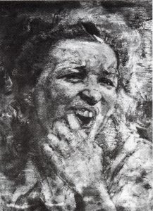
Figure 9: Isabel Bishop, Toothache, 1949, oil and tempera on canvas: 12 x 9 in. Whereabouts Unknown. From: Helen Yglesias. Isabel Bishop (New York: Rizzoli International Publications, Inc., 1998), 21.
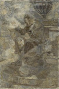
Figure 10: Isabel Bishop, Mending, 1945, oil on fiberboard: 6-7/8 x 4-7/8 in. Smithsonian American Art Museum, Washington D.C. Gift of the Sara Roby Foundation, 1986.6.7.
The connection between social mobility and Bishop’s atmospheric figure-ground relationships become complicated when the figure appears unconcerned with social mobility. Todd’s understanding of deference as a contributing factor to her subjects’ social mobility begins to fall apart when applied to the painting Toothache. Additionally, the link between murky figure-ground relationships and social mobility is not easily applicable to other subjects in Bishop’s oeuvre. Bishop was interested in the women in Union Square, but she also painted homeless men with equally textural and complex figure-ground relationships. In a discussion of Mending (Figure 10), painted in 1945, Bishop stated, “Enveloped in morning light, the man, his action, and the fountain, seem all of one piece and somehow alone, remote […] I have tried to give the sense of one-ness by weaving the figure and surroundings together.”[31] Later in her career, she created many sketches and some paintings of students walking to class that exhibit similar backgrounds. Todd’s argument about Bishop’s ambiguous figure-ground relationship raises interesting questions about the unusual ways in which social mobility, even in a somewhat limited scope, can be conveyed through painting. However, the atmospheric quality and blurred figure-ground relationship of Bishop’s works is equally a rejection of the gendered hierarchies in academic teaching, and the hierarchy of media that privileged finished painting over preparatory drawing.
The history of drawing, then, is essential to understanding the role of drawing and gender politics in Isabel Bishop’s work. Typically considered a preparatory medium, drawing in the academy was intended to be covered by paint. The medium of drawing was also associated with traditionally “feminine” adjectives like “small,” “intimate,” and “subordinate.” Painting, on the other hand, has traditionally been termed “masculine,” “large,” “complete,” “powerful.” Although Bishop did use drawing in a preparatory fashion, she also applied drawing and line to an otherwise painterly surface, thereby re-ordering and remixing the method of creating art that was proscribed in the European art academies and promoted by theorists like Wölfflin. In fact, Bishop literally draws figures into and on top of paintings, thereby prioritizing drawing. Unfinished linear qualities make figures like the woman in Bending Down and the two women in At the Noon Hour appear in a complex state of emerging. Even in their completed state, Bishop’s paintings take on a dynamic, momentary feeling of becoming.
In his essay on drawing, philosopher Alain Badiou describes how drawings are always in the state of becoming, or coming into existence. He states,
It is that sort of movable reciprocity between existence and inexistence which constitutes the very essence of Drawing. The question of Drawing is very different from the question in Hamlet. It is not “to be or not to be,” it is “to be and not to be.” And that is the reason for the fundamental fragility of Drawing: not a clear alternative, to be or not to be, but an obscure and paradoxical conjunction, to be and not to be.[32]
If all drawings are fundamentally related to their process (or coming into existence), so are Bishop’s paintings. Certainly, the relationship of figure to ground in Bending Down makes more sense when considered in conjunction with Bishop’s paintings. Like Bishop’s paintings, Bending Down captures the authentic and momentary movement of everyday life and typifies the foggy figure-ground relationship of paintings like At the Noon Hour. The UMCA drawing depicts one of Bishop’s most relevant subjects and displays the artist’s interest in complicating and compressing the figure-ground relationship. The atmospheric depiction of Bishop’s painted figures is achieved through a layering of drawing and painting that subverts the traditional media hierarchies, and the gendered hierarchies that are implicit in them. As Bishop would say, “incompleteness is the essence of the matter.”[33] Truly, the modernity of Isabel Bishop’s paintings lies not only in her choice of new women as subjects, but is also literally grounded in her preference for the unfinished and the incomplete — for the aesthetic of drawing.
[1] Ellen Wiley Todd, The “New Woman” Revised: Painting Gender and Politics on Fourteenth Street (Oxford, England: The University of California Press, 1993), 289.
[2] Martha H., Patterson, The American New Woman Revisited: A Reader, 1894-1930 (Rutgers University Press, 2008), 46-48.
[3] Todd, The “New Woman” Revised: Painting Gender and Politics on Fourteenth Street, xxvii.
[4] Helen Yglesias, Isabel Bishop, (New York: Rizzoli International Publications, Inc., 1998), 19.
[5] Todd, The “New Woman” Revised: Painting Gender and Politics on Fourteenth Street, 76.
[6] For more on the history of academic drawing, see Deanna Petherbridge, “Drawing and Learning,” Ch. 8 in The Primacy of Drawing: Histories and Theories of Practice (New Haven: Yale University Press, 2010).
[7] Deanna Petherbridge, “Drawing and Learning,” 227.
[8] Quoted in Karl Lunde, Isabel Bishop (New York: Harry N. Abrams, Inc., 1975), 28.
[9] Karl Lunde, Isabel Bishop (New York: Harry N. Abrams, Inc., 1975), 14.
[10] Linda Weintraub, “Isabel Bishop—First Impressions” In Isabel Bishop by Helen Yglesias (New York: Rizzoli International Publications, Inc., 1998), 145.
[11] Margaret Samu, “Impressionism: Art and Modernity,” Metropolitan Museum of Art, 2004.
[12] The connection with Rembrandt is made by Ellen Ekedal in the forward of Isabel Bishop: The Affectionate Eye. Ellen Wiley Todd also compares Bishop’s work to Rembrandt’s Hendrickje which resides at the Louvre.
[13] Lunde, Isabel Bishop, 43-44.
[14] Lunde, Isabel Bishop, 62.
[15] Lunde, Isabel Bishop, 63-4.
[16] Yglesias, Isabel Bishop, 18.
[17] Quoted in Lunde, Isabel Bishop, 64.
[18] Quoted in Yglesias, Isabel Bishop, 21.
[19] Heinrich Wölfflin, Principles of Art History: The Problem of the Development of Style in Later Art, translated by M. D. Hottinger (New York: Dover Publications, 1950), 19.
[20] Linda Nochlin, “Why Have There Been No Great Women Artists?” In Women, Art, and Power edited by Linda Nochlin (New York: Harper and Row, 1988), 159.
[21] Yglesias, Isabel Bishop, 7.
[22] Yglesias, Isabel Bishop, 9.
[23] Todd, The “New Woman” Revised: Painting Gender and Politics on Fourteenth Street, 292.
[24] Ibid., 289.
[25] Ibid, 291.
[26] Ibid, 283.
[27] Ibid., 297-8.
[28] Ibid., 301.
[29] Ibid., 302.
[30] Bruce St. John, Isabel Bishop: The Affectionate Eye, (Los Angeles, California: Loyola Marymount University, 1985), 44.
[31] Lunde, Isabel Bishop, 71.
[32] Alain Badiou, “Drawing,” Lacanian Ink (2011).
[33] Lunde, Isabel Bishop, 43.
Bibliography
Badiou, Alain. “Drawing,” Lacanian Ink 28 (2011),
Lunde, Karl. Isabel Bishop. New York: Harry N. Abrams, Inc., 1975.
“Miracle of Movement: Isabel Bishop in Union Square, New York at the National Museum of Women in the Arts.” NMWA.org, last modified March 6 2009.
Nochlin, Linda. “Why Have There Been No Great Women Artists?” In Women, Art, and Power edited by Linda Nochlin. New York: Harper and Row, 1988.
Patterson, Martha H., ed. The American New Woman Revisited: A Reader, 1894-1930. Rutgers University Press, 2008.
Petherbridge, Deanna. “Drawing and Learning,” Ch. 8 in The Primacy of Drawing: Histories and Theories of Practice, 210-233. New Haven: Yale University Press, 2010.
Samu, Margaret. “Impressionism: Art and Modernity.” Metropolitian Museum of Art. Last modified October 2004.
St. John, Bruce. Isabel Bishop: The Affectionate Eye. Los Angeles, California: Loyola Marymount University, 1985.
Todd, Ellen Wiley. The “New Woman” Revised: Painting Gender and Politics on Fourteenth Street. Oxford, England: The University of California Press, 1993.
Weintraub, Linda. “Isabel Bishop—First Impressions” In Isabel Bishop by Helen Yglesias, 145-148. New York: Rizzoli International Publications, Inc., 1998.
Wölfflin, Heinrich. Principles of Art History: The Problem of the Development of Style in Later Art. Translated by M. D. Hottinger. New York: Dover Publications, 1950.
Yglesias, Helen. Isabel Bishop. New York: Rizzoli International Publications, Inc., 1998.
