ELEMENTS OF VISUAL ART
Line
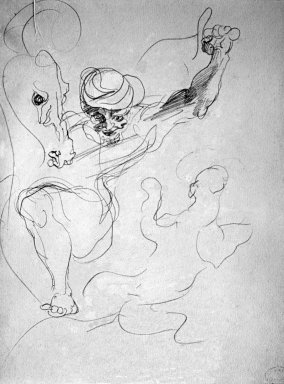
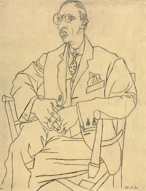
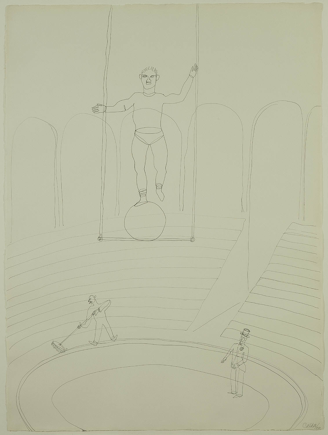
Line is a continuous mark made on a surface by a moving point. It can be fluid or angular, smooth, rough, free or controlled, thick or thin, geometric or organic. In general, straight horizontal and vertical lines create a sense of stability. Curved lines suggest motion and diagonal lines give a feeling of instability. Examine the drawings by Delacroix, Picasso, and Calder shown below. What particular kinds of line does each artist use, and to what end?
Shape and Form
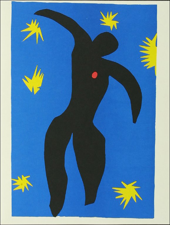
When lines meet or enclose space, they create two-dimensional (2D) or three-dimensional (3D) objects. The terms shape and form refer to these objects. Shape describes a two-dimensional object having width and height, and form describes a three-dimensional object having width, height, and depth. Shape is present in all visual art; the medium of sculpture in particular relies on the use of form. Shape and form can be inspired by geometry (circles, triangles, other regular, artificial shapes) and organic outlines (leaf, stone, branch, more irregular, naturally occurring shapes). Below are two very different versions of a human figure with outspread arms – Matisse’s Untitled 2D work, and the 3D Winged Victory of Samothrace. Notice how in both instances line encloses space – in Matisse’s work, line encloses two-dimensional space to create shape, and in with the Winged Victory of Samothrace, it encloses three-dimensional space to create form.

Texture
Texture is the surface quality of a work of art. Both two-dimensional and three- dimensional art rely on texture to convey tactile qualities. In a 2D work such as painting, texture can implied, or it can be the actual physical property of the surface of the artwork. Georges Roualt built up a dense, rough surface texture in his painting The Old King.

Flemish painters such as Jan Van Eyk were expert in creating the illusion of textures on a two dimensional surface. In the Arnolfini Wedding Portrait, Van Eyk has created the illusion of glass, fur, lace, and wood on a two dimensional surface.
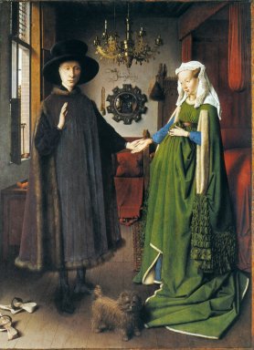
National Gallery, London. Oil painting on wood panel
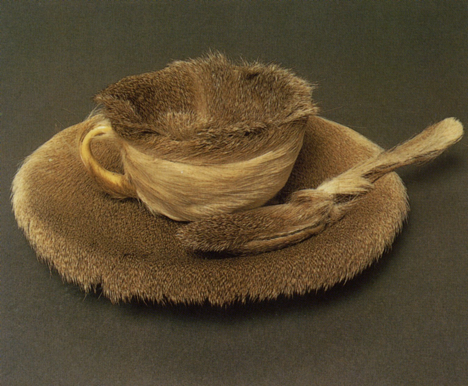
In 3D works, artists may choose to work with specific materials because of their surface qualities, as in the Fur-lined Tea Cup by Meret Oppenheim. What does her use of fur suggest to you?
Space
In visual art the term space refers to all the area within, around, and between the parts of an image. Space can be described in terms of positive (where the focus of attention is) and negative (areas that aren’t the focus of attention). In sculpture it can also be thought of in terms of where the material is (positive), and where it is not (negative).

Albright-Knox Art Gallery, Buffalo, NY
In what way is the negative space in this bronze sculpture by Barbara Hepworth an integral part of the composition?
Value (Light and Dark)
Value is the range of light to dark that an artist employs in a work of art. In this painting, The Calling of St. Matthew (c 1600) by Caravaggio, Jesus has entered the counting house of Levi to call him to service. Notice that the light source is a shaft of light from outside that Caravaggio juxtaposes with the shadows of the room. Caravaggio has used this intense contrast of light and dark values to heighten the drama of the scene and to guide the eye of the viewer.

Color
Color is created by a wavelength of light as it bounces off surfaces. It can be described in terms of hue (color names like “blue” and “green”), value (how light or dark a color can be), saturation (amount of pigment), or temperature (warmth or coolness).
Color Wheel
The color wheel is divided into three categories: primary, secondary, and tertiary.
- Primary: Red, Yellow, Blue (Foundation Colors)
- Secondary: Orange, Green, Violet (Made by combining 2 primary colors)
- Tertiary/Intermediate: Red-orange, Red-violet, Yellow-green, Yellow-orange, Blue-green and Blue- violet

Tint and Shade
A tint of a color is made by adding white. A shade is made by adding black.

Complementary Colors
If two hues are opposite each other on the color wheel they are considered to be complementary colors. Complementary colors are ones which share no common colors. When used together in a design, they make each other seem brighter and more intense (example: red and green). When mixed together, they make brown.

Warm and Cool
Colors are called warm or cool because of our association with various elements in our surroundings. Artists use warm and cool colors to create moods, show contrast and create depth in artworks.

Red, yellow and orange are considered warm colors.

Blue, green and violet are considered cool colors.

These contrasts are relative since yellow-green is cool next to red, orange or yellow, but would be considered warm next to blue-violet.
Perceptually, cool colors tend to recede into the distance whereas warm colors appear to advance.

Getty Museum Elements of Art printout
Getty Museum Principles of Design printout
Galleries __________________________________________________________________
Renaissance Art | Baroque Art | Neoclassicism | Romantic Art | Impressionism | Modern