Letter to the Northampton Public School Committee, sent by e-mail March 3 2021.
Dear School Committeee members,
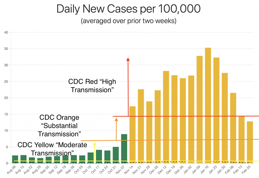
I am writing to share a couple graphs I made that illustrate how the CDC metric from the Feb. 12th school reopening guidance applies locally. The first graph shows the Northampton daily new case rates from the MassDPH public health reports. The dates are the ends of the two-week period over which the daily rate is averaged (the period ending Feb. 20 is from the Feb. 25 report). The CDC Red “High Transmission” category is greater or equal to 100 cases per week, so 14.3 cases per day. Orange “Substantial Transmission” is 50 per week or greater, so just over 7 per day. Yellow “Moderate Transmission” is 10-49, so 1.4 – 7 per day.
The colors of the bars correspond to the MassDPH classifications. This graph illustrates a flaw in that system, which is also illustrated by the fact that Amherst was categorized as yellow at the peak of the UMass outbreak, when it had 113 cases per 100K. The flaw has to do with how the MassDPH metric uses the positivity rate – I have a discussion here if you are interested. The most current data has us in the orange category, with almost exactly the same rate as we had in November. The graph on which I added the CDC categories comes from this very useful site created by a UMass Amherst computer science alum – you can find weekly updated interactive graphs for all Mass municipalities there.
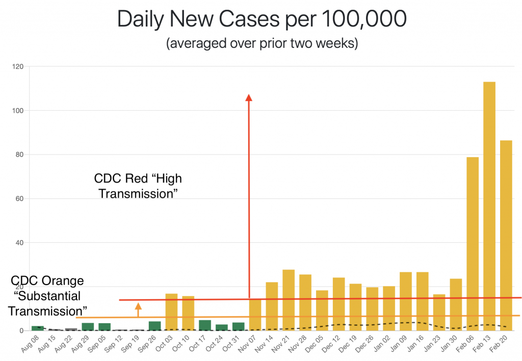
The next graph shows weekly totals of new cases for Hampshire County from the MassDPH data, along with weekly totals with the data from UMass Amherst subtracted. There is more on this method here. The lines show how these totals correspond to the categories. With a population of 160K, 160 cases corresponds to 100 cases per 100K, the bottom end of the CDC Red category, and 80 cases corresponds to the bottom end of the CDC Orange category.

It is not totally obvious to me which of the three numbers are best to use is local decision making. Using Northampton alone, or Hampshire minus UMass ignores the added risk of a nearby outbreak, while using the Hampshire number perhaps exaggerates the risk that the UMass outbreak ads to our situation here in Northampton.
I’d like to encourage you to have a look at the guidance with these numbers in mind, if you aren’t familiar with it already. This NPR piece gives a good overview, calling it a “measured, data-driven effort”. It also links to the full guidance. Table 2 in the CDC document provides some guidance using the transmission levels – I’ve pasted it beneath my signature.
All the best,
Joe Pater
Northampton resident, father of a Jackson Street School student

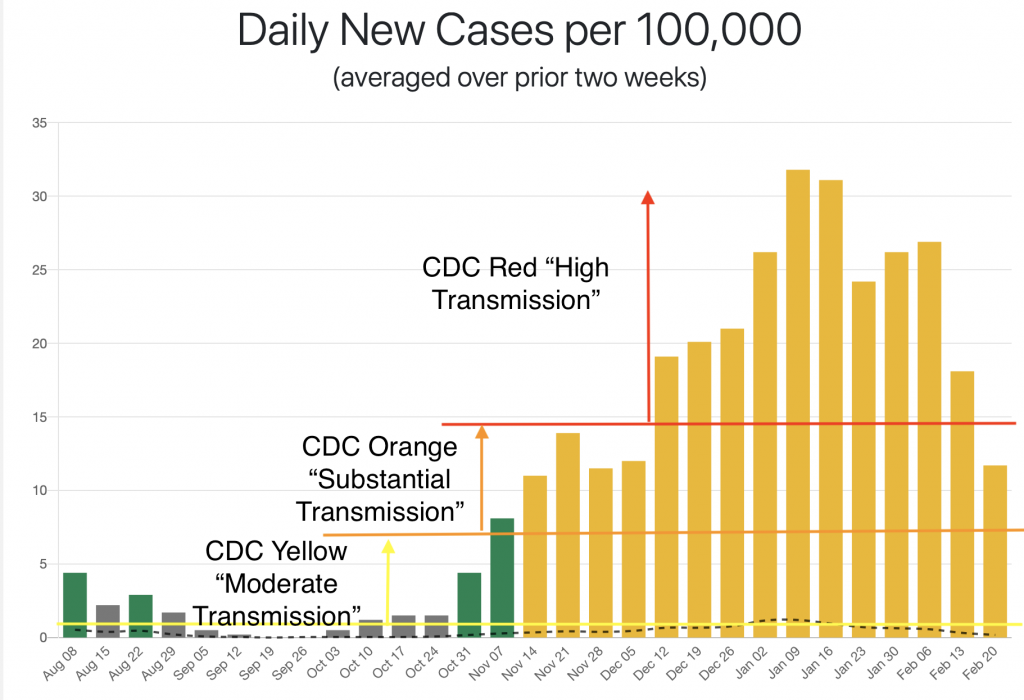
Update (not in e-mail): here are graphs for Cambridge and Amherst