The CDC released a new color-coded Covid-19 transmission level metric as part of their Feb. 12 2021 guidance for school reopening. This post explains how it works, how it can be interpreted, and why it is better than the Massachusetts Covid-19 metric for community classification.
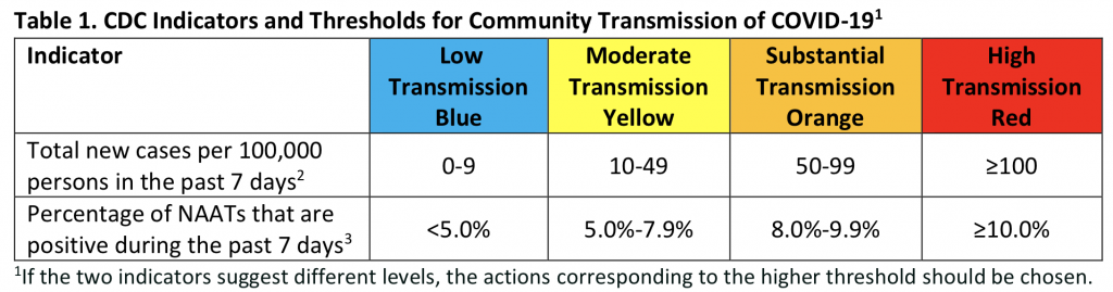
The new case levels in the first row are given as a per capita weekly total (the number of cases times 100,000 divided by the population). To convert to a weekly total from a daily average as provided by the MassDPH, multiply by seven, and from a two-week total as you might find elsewhere, divide by two. An advantage of a weekly total over a daily average is that it’s more transparently related to the number that we really care about: how many cases of Covid-19 are in a community. (I’ve seen active cases estimated as anywhere from 10 to 21 days of new cases, and the number of infections has recently been estimated as about 4 times the new case number). All of these numbers have the advantage over raw daily counts that they smooth over irrelevant factors, like the differences between weekend and weekday test rates.
“New cases” is the number of people diagnosed with a positive molecular test. The second row in the above table “Percentage of NAATs…” shows positivity rates that are based on the number of tests that are positive, over the number of tests. Because it’s based on number of tests rather than people, the positivity rate is not a good measure of the incidence of the disease. Rather, it is a usually used as a measure of whether enough testing is being done; high positivity rates indicate a high proportion of (highly) symptomatic people being tested. In the CDC metric, the positivity rate measure is a safeguard against having a low new case count because you aren’t doing enough testing. The metric takes the higher of the classifications, for example placing a community in Yellow if the positivity rate is higher than 5%, even if the case rate is beneath ten per week. In Massachusetts there is now sufficient testing that we can pretty safely ignore this number, and just use new case rates for classification (e.g. in the April 1 report, all the 61 communities that had 5% or greater positivity also had 50 or more new cases per week, which would have placed them at least in the CDC Orange category already).
The CDC provided this metric as a part of its guidance on best practices for school reopening, as shown in the further tables appended at the end of this post. This kind of community transmission level metric is also useful for providing a rubric for quickly comparing across communities (on a color-coded map, for instance), and can also be used to guide other sorts of decision making, by officials, businesses, and even individuals. The CDC has not yet released guidance on how to use its metric in these ways (update: their late July 2021 revised mask guidance uses it), but the New York Times provides guidance for individuals relative to a current risk level “developed with public health experts at Johns Hopkins Bloomberg School of Public Health and Resolve to Save Lives, an initiative of Vital Strategies.” The NYTimes metric uses new case rates and percent test positivity in a similar way to the CDC metric, but its levels are defined differently, so we can’t map it directly. We can get a sense of how we can apply the CDC levels by comparing the NYTimes guidance on indoor activities for “Very High Risk” (> 80 new cases per 100K per week) and “Medium Risk” (5 – 20).

See this Atlantic article on discrepancies between state restrictions and advice for individuals (it also cites an epidemiologist as providing 70 per week per 100K as an upper bound on a personal decision to eat indoors at a restaurant).
The Massachusetts color-coded metric uses positivity rates in a different way than the CDC and the NYTimes/Hopkins metrics, in a way that doesn’t seem to make much sense. In the MA metric, for communities over 10K population, the difference between the Yellow and the Red classification is based on positivity rate alone (under 10K is done on raw counts of new cases). A community is classified as Yellow if it has a new case rate of 70 per week per 100K or more (note that this is a much higher bar than the CDC or NYTimes metrics). To be classified as Red, it must have in addition a positivity rate of greater than 4% (5% in communities smaller than 50K). Since the positivity rate is more a measure of testing than incidence, this would seem to mean: “As long as there is enough testing, there is only a moderate risk of transmission, no matter how high the new case rate is.”
The result of the MA metric’s unusual application of positivity rate is that apparently very different rates of incidence are all classified as yellow. This is shown in the following tables, which are based on bar graphs showing the average daily new case rates over the previous 2-weeks from the MassDPH public health reports, provided by http://matowncovid.org. The positivity rates are the dashed lines. I have indicated the classifications that the CDC metric would make on these rates.
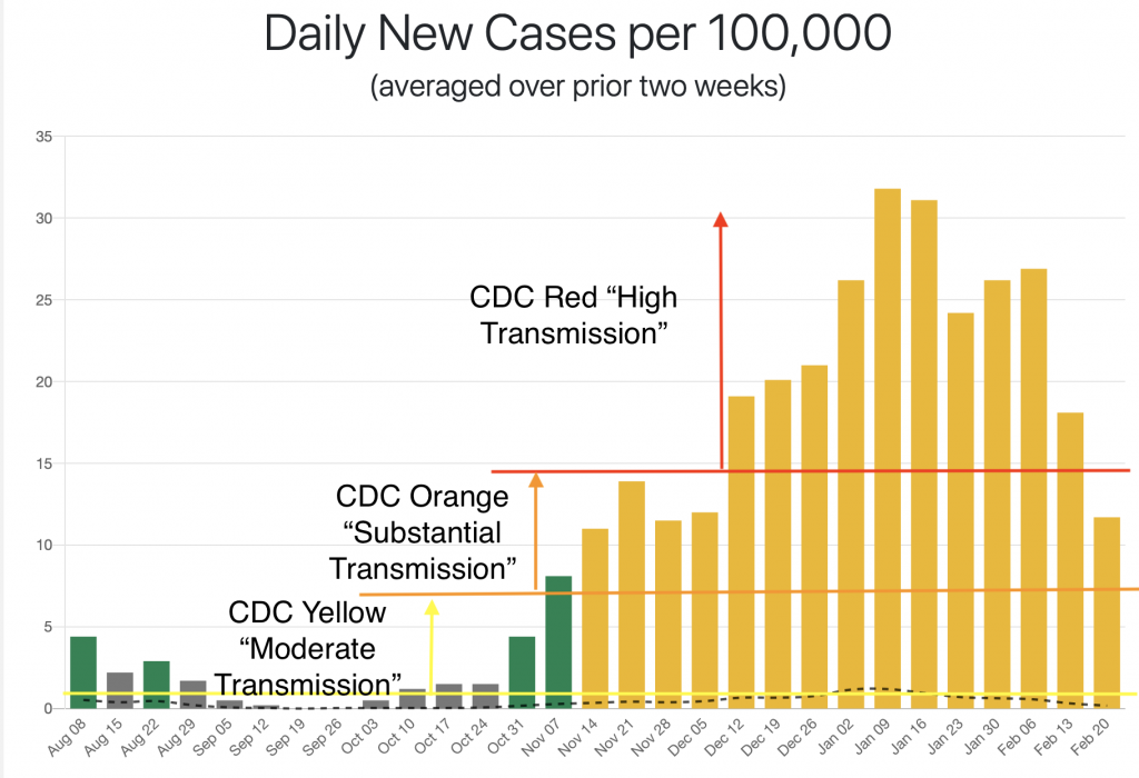
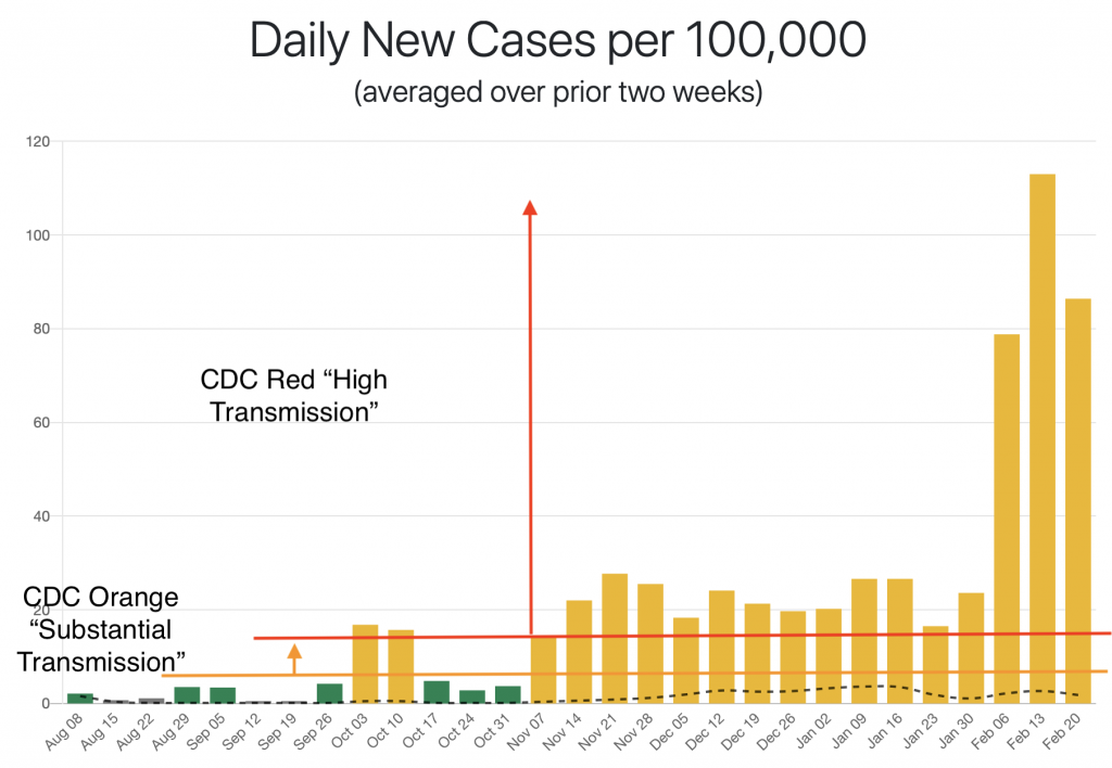
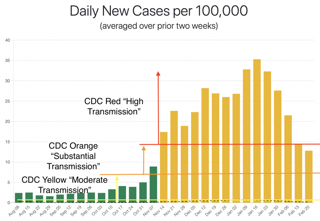
Northampton, Amherst and Cambridge were not chosen at random. These are all municipalities with a high concentration of individuals being tested at higher ed institutions, which artificially depresses the overall positivity rate. They therefore provide a particularly striking illustration of this general problem.
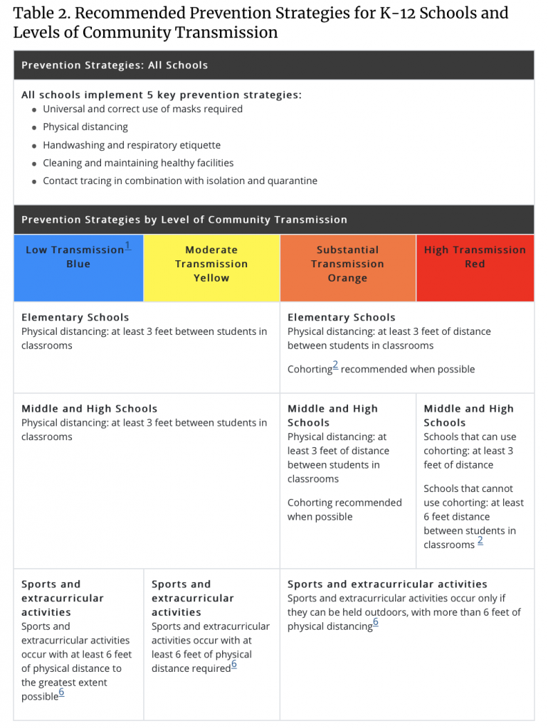
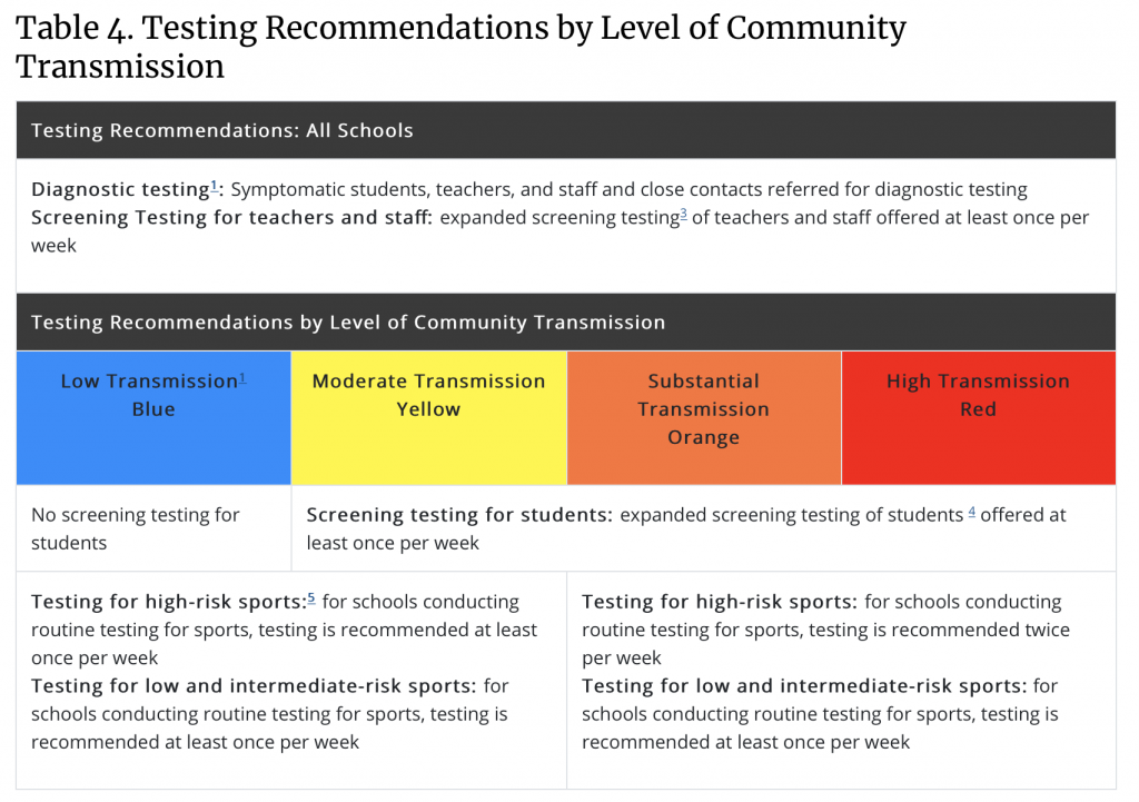
CDC transmission levels applied in school reopening guidance (from the March 19 update).