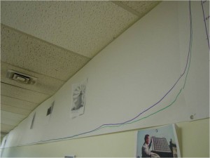
In this project, students identified key milestones in the development of human energy use, and related these discoveries to human population growth. The milestones were plotted on a graph that used a consistent time interval of 1 meter = 1000 years. The chart shown in the attached image includes:
- Agriculture – 12000 years ago
- Domestication –9000 years ago (except dogs, 33,000 years ago-not shown on chart.)
- Sailing ships – 3000 years ago
- Water mills (for grain) – 2000 years ago
- Wind mills (for grain) – 1000 years ago
- Steam engine – 250 years ago
One of the learning objectives was to provide an experience that would allow students to consider how the use of scale on graphs influence our understanding of data. Graphs of human energy use and population growth are easy enough to locate on the web, however many of these charts employ an inconsistent time interval, with spans of hundreds, thousands, and even millions of years more or less evenly spaced along the x-axis. When the scale intervals are inconsistent, they may impair the viewers ability to fully comprehend the nature of the relationship between the independent and dependent variables. Students were able to compare/contrast their data plotted using a consistent scale with many charts that did not use a consistent scale.