The University of Massachusetts Amherst
Categories
Uncategorized

School mask mandates still make good sense in Hampshire County

Published in the Hampshire Gazette Feb. 23, 2022. This open letter was co-authored with Seth Cable, Summer Cable, Michael Stein and Susan Voss, and was also signed by 216 other people that live and work in Hampshire County, listed at the end of this letter. For further information on Covid safety in schools, please see the Urgency of Equity toolkit.

An opinion column published in the Hampshire Gazette on Feb. 17 2022 claims that “even if at one point in the pandemic it was possible to make a reasonable argument for the masking of children in school, that is no longer the case”. We disagree, since the following provides what we take to be a clearly reasonable basis for deciding to continue the school mask mandates until the levels of community transmission subside to a much lower level. We offer this as a statement of views that we believe are widespread, but are usually not made as vocally as those of the opponents of mask mandates and other public health measures.

1. It is reasonable to minimize spread in our community by using school masking. Our children interact with other members of the community, some of whom are relatively vulnerable to the effects of Covid-19 infection. By slowing spread in our schools, we are also slowing spread in our communities. The authors of the opinion column claim that “[t]here are no credible scientific data indicating that masking of children in schools has limited the spread of COVID-19”. They do not say why they do not consider the data presented by the CDC or other data to be credible. It is possible that they consider only data from randomized controlled trials (RCTs) to be credible, since they say in the next sentence that “[n]o randomized controlled trials of mandatory school masking have been carried out”. The CDC and other experts clearly consider sources of evidence other than RCTs to be useful, and it is not difficult to imagine why no RCTs have been run on school masking. For example, Institutional Review Boards may well balk at approving a study with a control group of unmasked students in a community with high transmission. 

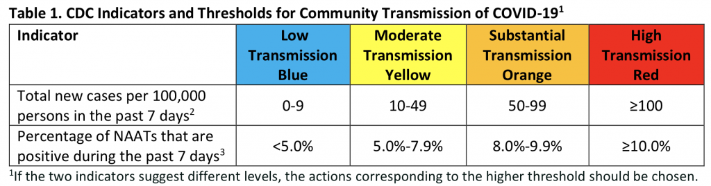
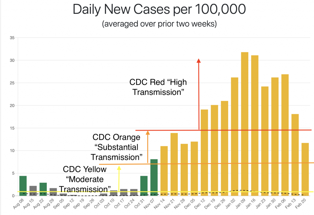
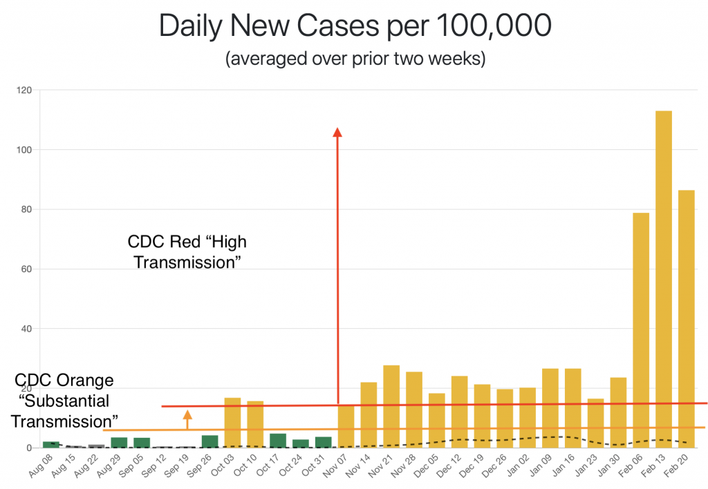
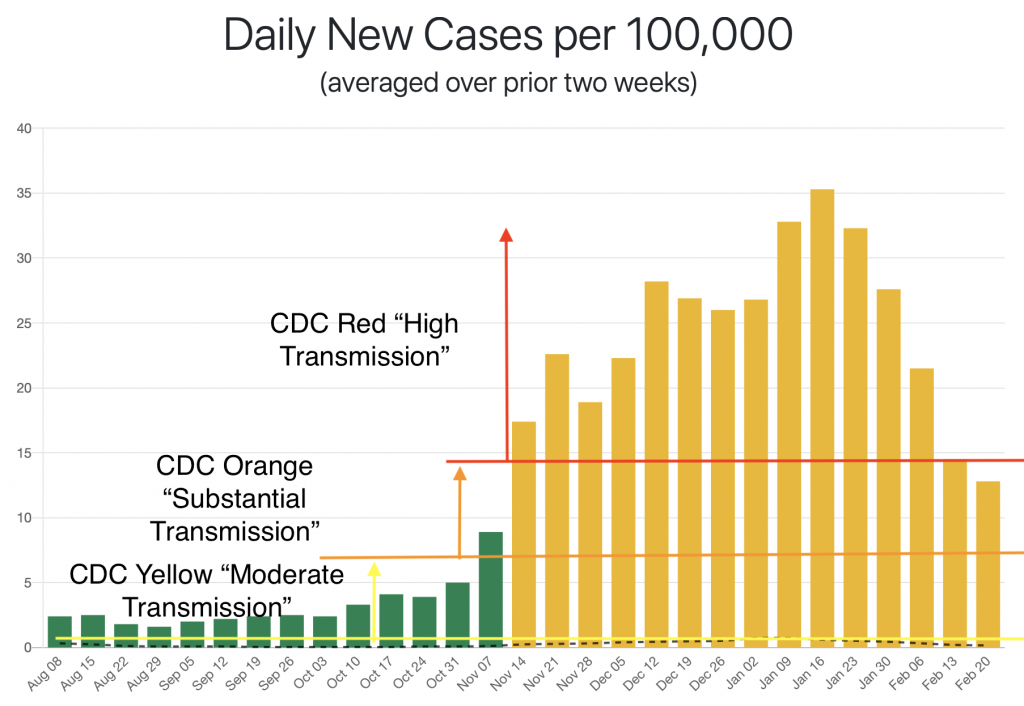
2. It is reasonable to characterize the current local level of community transmission as high, and the risk to community health of that transmission as high as well. According to Mass-DPH data, there were 680 new cases in Hampshire County the week ending Feb. 17, which translates to a per capita rate that is over 4 times the CDC’s bar for “high transmission”, and over 8 times the bar for indoor mask wearing. Many of those cases are likely from an outbreak at UMass Amherst, which reported 456 cases in the week ending Feb. 15th. The future impact to the broader community of that outbreak is unknown. The Mass-DPH reports 37 Covid-19 deaths in the last 28 days in Hampshire County, which can reasonably be taken to indicate a high community health risk.

3. It is reasonable to minimize Covid-19 infections in our children. While most children recover quickly from Covid-19 and have mild symptoms, some wind up in hospital, and some die. That the proportion of deaths is lower than in adults, or that the number is lower than child deaths from some other cause, does not make it any less desirable to avoid those deaths. In addition, the long-term effects of these infections is unknown. There are clearly long-term effects of Covid-19 infections in general. We can only hope that childhood infections with Omicron, especially in vaccinated children, will have fewer long-term effects.

4. Mandates maximize the protection of each individual. If everyone in a room wears a mask, the amount of airborne virus is minimized, maximizing the protection for everyone. It is a less effective protection for an individual if others are maskless. This is especially true if that individual does not have the mask perfectly fitted, or occasionally takes it off to eat or drink, circumstances that seem common in a school. Wearing a mask is not just about protecting oneself, it is also for the protection of the community, including its most vulnerable members. For example, universal masking allows children who are immune compromised or otherwise at high risk for severe disease and children who have family members who are immune compromised to attend school when it would otherwise be unsafe to do so. 

5. It is reasonable to decide that real or potential negative effects of masking are outweighed by their positive benefits in minimizing Covid-19 infections. There seems to be no good evidence of negative effects of masking on child development. It is quite possible that speakers of non-mainstream varieties of English (e.g. second language speakers) may be more impacted than others by mask wearing. Real and potential negative effects should be taken into account in any decision about a mask mandate, and attempts should be made to address them when masking is in effect. But it may well be that the benefits of masks outweigh any risks.  

Signed by:

Joe Pater, Northampton resident and Professor of Linguistics, UMass Amherst

Summer Cable, Northampton resident

Seth Cable, Florence resident and UMass Faculty

Susan Voss, Northampton resident and Professor of Engineering, Smith College

Michael Stein, Northampton Resident, Ward 4 School Committee Member

Jennifer Ritz Sullivan, COVIDJustice Leader for Massachusetts with Marked By COVID  Goshen

Suzanne Theberge MPH, Northampton 

Tom Roeper, Amherst

Naomi Gerstel, Professor emerita UMass, resident Northampton

Rene Theberge, Retired Public Health Worker, Florence

Neil Kudler MD, Physician

Kirsten Leng, Resident of Northampton, Associate Professor, Women, Gender, Sexuality Studies, University of Massachusetts Amherst

Jean Potter, Doula, Northampton 

Frazer Ward, Northampton

Erica Kates, Florence, MA

Thomas Wartenberg, Professor of Philosophy, Emeritus, Mount Holyoke College

Jen Davis, Northampton

Lou Davis, Financial Planner and Advisor, Northampton

Wenona Rymond-Richmond, Northampton

Eric Poehler, Northampton

Karen Foster, Ward 2 City Councilor

Erin Kates, Resident of Florence 

Sarah Metcalf, writer, Northampton resident

Christopher Pye, teacher, Northampton resident

Andrew Kennard, Postdoctoral Fellow, UMass Amherst. Amherst resident

Tom Riddell, Northampton

Beth Adel, Teacher and resident of Northampton 

Elliot Fratkin, Professor Emeritus Smith College. Northampton

Sally Popper, Retired, Northampton

Robert Buscher, Northampton

Laura Briggs, Professor, University of Massachusetts and Northampton resident

Maureen Flannery, Northampton

Steven Goode, Northampton

Christopher Golden, parent and NOAA software engineer, Northampton

Hedy Rose, retired educator, Northampton resident

Norma Akamatsu, Social Worker, Psychotherapist, Northampton

Ian Goodman, MD, Pediatrician and Northampton Resident

Angela Silvia, CT technologist, Northampton, MA

Meg Robbins, Resident,  Northampton, MA

Traci Olsen, Northampton

Jennifer L. Nye, Northampton resident and UMass Amherst faculty member (History)

Anisa Schardl, Northampton Public Schools teacher and parent

Janet Gross, Retired

Nicolas Gross, Retired

Matthew Hine, Service Engineer (Aerospace), Northampton

John Selfridge, public school teacher, Northampton

Sara Lennox, Northampton

Jill de Villiers, Professor, Smith College, Northampton resident

Daniel Cannity, Northampton Resident

Rachel Merrell, Teacher

Cora Fernandez Anderson, Assistant Professor at Mount Holyoke College, Amherst resident

Melinda Buckwalter, Williamsburg

Emily Hamilton, Professor of history of science/medicine

Taylor Flynn, Parent & retired professor, Northampton MA

Deborah Keisch, Florence

Adele Franks, Public health physician, retired

Young Min Moon, Professor, UMass Amherst

Jude Almeida, School-Based Social Worker, Northampton resident

Karin Baker, Teacher, Northampton

Meghan  Armstrong-Abrami, Associate Professor of Hispanic Linguistics, Northampton resident

Lynn Posner Rice, Northampton

Justin Pizzoferrato, Father/self employed

Greg Lewis, Public Health Emergency Planner, Northampton

Alyssa Lovell, school-based OTR/L 

Kim Gerould, Northampton

Omar Dahi, College professor 

Kai Simon, Northampton 

Andrea Ayvazian, Pastor, Northampton resident

Jennifer Fronc, UMass Faculty; Northampton resident

Graciela Monteagudo, Senior Lecturer, UMass Amherst, Amherst Resident

Roberta Issler, Retired teacher

Cathy McNally consultant, Northampton

Rachel Wysoker, Northampton

T. Stephen Jones, MD, MPH retired public health physician 

Alison Morse, Educator

Cory Ellen Gatrall, Registered Nurse

John McNally, Attorney and grandparent, Northampton

Jeff Napolitano, Northampton, MA

Rebecca Busansky, Northampton

Rachel Yox, Amherst

Judd Gledhill, Director IT

Meg Bogdan, Parent of Northampton Public School Students

Roz Chapman, Northampton 

Lisa Weremeichik,  Northampton

Charles Dumont, MD MS Pulmonary and Critical Care physician

Tara Dumont, MD Physician

Rebecca Burwell, Professor 

Karen Sullivan, College staff, Northampton

Victoria  Dixon, Disabilities Advocate, Amherst 

Leah Greenberger, veterinarian, Belchertown MA

Annie Salsich, Self-employed 

Gabriel Phipps, Adjunct Professor

Karen Hodges, Florence

Katherine Fabel, DUA and Lecturer, UMass Amherst, Florence MA

Nykole Roche, Northampton resident w/3 kids in NPS

Garrett Warren, Amherst

Annabelle Link, Northampton

Capella Sherwood, Music teacher/ Northampton

Bertha Thorman, Northampton

Neha Kennard, Amherst

Kelly Link, Writer

Lesley Yalen, Florence, MA

David Arnold, UMass Professor of Psychological and Brain Sciences

Kristen Elde, Leeds

Lisa Harvey, Professor of Psychological & Brain Sciences at UMass, Resident of Amherst

Michael Becker, Hadley resident and UMass Faculty

Henry Rosenberg, Northampton

Andrew Gorry, Staff, UMass Amherst

Eddie (Erin) Gorry, UMass Staff, Resident of Florence, MA

Leeba Morse, Grant Writer

Jonathan Knapp, Northampton Public Schools educator

Alexis Callender, Works as faculty in Northampton, Lives in Easthampton

Megan Paik, Northampton

Mary Hoyer, Amherst resident and retired Hartford Public Schools teacher

Terianne Falcone, Writer / teacher

David Ball, Northampton

Renee Spring, Amherst Psychotherapist

Therese Kim, Social Worker

Anand Soorneedi, Amherst

Dorcas Grigg-Saito, Northampton, retired Community Health Center CEO

Erica Deighton, Retired educator, Amherst resident.

Steve Waksman, Elsie Irwin Sweeney Professor of Music, Smith College

Cornelia Daniel, Retired in Amherst

Christine Clark, Dental Hygienist 

Wendy Sutter, Amherst resident

Lijah Joyce, Amherst 

Patricia Maynard, Retired teacher. Northampton resident 

Heather Brown, Educator, Northampton 

Marissa Elkins, Attorney/City Councilor 

Mary Savarese, Retired Teacher 

Peggy Matthews-Nilsen, Amherst (Psychotherapist, Retired)

Julia Frisby, Hatfield MA

Karen Osborn, Anherst

Lisa Moos, Physical Therapist Assistant 

Patricia Duffy, Leverett

Barbara Palangi, Retired

Elizabeth Jimenez, Northampton

Sandy Oldershaw, South Hadley 

Tania Menz, Hatfield Resident, Hadley Family Physician

Kimberly Schlichting, resident of Hadley, teacher in Northampton

Elizabeth Hallstrom, resident of Amherst

Kasey Mimitz, Youth services coordinator

Scarlett Mimitz, Student

Nora Mimitz, Student

Emily Kawano, Non-profit Co-director

Jalen Michals Levy, EMT-B

Andrea Gaus, Farmer, Hatfield 

Melanie Miller, Northampton

Daniel and Angela Dee Amherst

Sandra Torrence, Teacher

Michelle Trim, Faculty at UMass Amherst/ South Hadley

Roberta Pato, Retired teacher, Northampton

Barbara Partee, Amherst resident and Professor Emerita, UMass Amherst

Norma Brunelle, Retired

Raymond R. Brunelle, Retired

Mark Brunelle, Laborer

Joanne Brunelle, Dental Assistant

Barbara Cooper, Retired teacher/librarian

Toni Brown, Hatfield

Faruk Akkus, Faculty at UMass Amherst

Felice Swados, South Hadley

Victoria Rosen, Northampton 

Felice Swados, South Hadley

Victoria Rosen, Northampton 

Jon Wynn, UMass Amherst, Associate Professor, Northampton Resident

Zelia Almeida, RN Pediatric ICU/ Belchertown 

Marci Linker, Occupational Therapist and Northampton resident

Lindsay Whittier-Liu, Northampton 

Sarah Wolfe, Northampton paralegal, resident of Belchertown

Jean Fay, Amherst educator

Lance Hodes, Pelham

Alex Robinson, Amherst

Barry Seth, Student in Amherst

Oliver Dubon, Amherst

Basil  Perkins, College Student

Ivonne Vidal, Belchertown, Attorney 

Tina Cornell, Florence 

Judith Trickey retired

Lisa  Packard, Amherst 

Bennett Lyons, Amherst, MA

Kate Matt, Shutesbury

Anne Hazzard, Amherst

Isolda Ortega-Bustamante, fundraiser; Amherst

Maureen Vezina, Belchertown 

Evelyn Trier, Mount Holyoke College Admission/ Amherst resident & parent

Katherine Kraft, retired, Amherst 

Marshall Cohen, retired, Amherst

Monroe Rabin, retired

George Collison, retired prof

Emilie Hamilton, Amherst

Stefan Gonick, Belchertown

John Hondrogen, retired and still masking in Pelham

David Gross, Pelham

Lili Kim, Amherst

Susan Watkins, Shutesbury

Amelia Vetter, Student, Amherst

Dan Levine, Business Owner

Theresa Ryan, Realtor

Jenny Miller Sechler, Psychotherapist, Northampton

Matthew Levin, retired pre-school/k teacher (Northampton)Hatfield (residence)

Robert Jackson, Amherst

Amy Dopp, Easthampton

Keri Heitner, Amherst

Anita Sarro, Retired Nurse-Attorney

Amy Hirsch, Psychologist

Emily Case, Amherst parent, Hatfield educator

Michelle McBride, UMASS Employee in Linguistics Department

Kimberly Stillwell, Speech Language Pathologist, Northampton

Delia Martinez, Retired teacher-keep masks in schools

Amy Martyn, Florence

Rebecca Leopold,Northampton, retired Amherst-Pelham HS teacher

Alicia Lopez, Teacher, Amherst

Sharon Moulton, Northampton

Louis Faassen, Architect

Scott Billups, Shutesbury

Jacqueline A. Faison, Pelham

Seth Lepore, Arts and Small Business Consultant, Easthampton, MA

Rachel Brod, Northampton

Stephanie and David Kraft, Retired

Jack Howe-Janssen, Florence

Annette Gates Teacher, Crocker Farm Elementary

Categories
Uncategorized

Historical UMass Covid-19 data

This graph shows one week totals for new cases reported on the UMass Amherst COVID-19 Dashboard. The gap in summer 2021 is due to a lack of reporting. Similarly, the gaps in the post-summer data at Thanksgiving and Christmas are due to weeks with no reporting.

The data pre-summer 2021 were downloaded May 14th 2021 from the dashboard. They do not seem to be available any longer there, so I have put the .csv file here. To create the weeks, I summed seven days of reporting, with the last seven day period ending 2021-05-10. Because some days had no reporting, these periods are sometimes longer than a week. The post-summer 2021 data were copied from the dashboard’s weekly reports. A .csv file with the data used to make the graph is available here.

Categories
Uncategorized

Materials for Summer Language and Music Research Group

Background reading on recent work by members of our group:

Moreton, Elliott, Brandon Prickett, Katya Pertsova, Josh Fennell, Joe Pater, and Lisa Sanders. Learning Repetition, but not Syllable Reversal. In Ryan Bennett, Richard Bibbs, Mykel Loren Brinkerhoff, Max J. Kaplan, Stephanie Rich, Nicholas Van Handel & Maya Wax Cavallaro (eds.), Supplemental Proceedings of the 2020 Annual Meeting on Phonology. Washington, DC: Linguistic Society of America. DOI: https://doi.org/10.3765/amp.v9i0.4912

Music versions of above experiment: work best in Chrome

No rule given: https://spellout.net/ibexexps/seungsuklee/music3_red/experiment.html
https://spellout.net/ibexexps/seungsuklee/music3_rev/experiment.html
Rule given:
https://spellout.net/ibexexps/seungsuklee/music4_red/experiment.html
https://spellout.net/ibexexps/seungsuklee/music4_rev/experiment.html

White, Christopher, Joe Pater and Mara Breen. 2021/in submission. A Comparative Analysis of Melodic Rhythm in Two Corpora of American Popular Music. Ms., University of Massachusetts Amherst and Mount Holyoke University.

Judge Russell’s Praat scripts from his REU work last year

Readings on musical grouping (relevant to class music experiment)

Patel 2008 on grouping

Deutsch 2013 grouping overview – see esp. pp. 209-213

De Liège 1987

Hutchison et al. 2015 “Minding the Gap: An Experimental Assessment of Musical Segmentation Models”.

Categories
Uncategorized

Three County Covid Tracker

This was a draft for the Shoestring Covid tracker, which is now live and updated every Friday by noon.

County and State Data

New case totals for week ending 3/11, per capita total using 2019 US census populations, CDC transmission level classification.

Hampshire – 223 new cases, 138.7 cases per 100K, CDC Red/High (prior week 271, 168.5 per 100K)

Hampden – 834 new cases, 178.8 cases per 100K, CDC Red/High (prior week 908, 194.7 per 100K)

Franklin – 48 new cases, 68.4 cases per 100K, CDC Orange/Substantial (prior week 30, 42.7 per 100K)

Massachusetts – 9353 new cases, 143.2 cases per 100K, CDC Red/High(prior week 9869, 143.2 per 100K)

Percentage of residents vaccinated

Hampshire – at least one dose 20%, fully vaccinated 12%

Hampden – at least one dose 18%, fully vaccinated 10%

Franklin – at least one dose 22%, fully vaccinated 11%

Current vaccination eligibility

Mass vaccination site sign-up (for all MA residents); check with your health care provider and local health board for other options.

Diagnosed cases of new variants of concern

From the CDC; the MassDPH does not maintain a public database. (Note that new variant testing rates remain very low in Massachusetts as well as the US as a whole in comparison to Canada and Europe).

Town and City Data

These tables provide totals of new Covid-19 cases for the weeks ending at the dates shown in the column headings. The per capita rates are color coded according to the CDC transmission level metric with Red indicating a High level, Orange Substantial, Yellow Moderate and Blue Low. Follow this link for an explanation of the metric, and a comparison with the one the MassDPH uses. Further details about the data and the tables are provided below.

These weekly totals are differences between totals from MassDPH public health reports from one week to the next (the reports came out two days after the dates shown above). Some inaccuracies in weekly totals calculated in this way may occur because of updates in earlier data (see e.g. –1 for Hatfield). Weekly totals per 100K based on populations supplied in the downloadable dashboard data. Asterisks indicate instances where one week’s total was given as <5, so the difference could not be calculated. “Change” is the current week over the last one; values in red are increases (values greater than 1). Blank values in Change indicate that one week had 0 cases, so a ratio could not be calculated. The county totals and populations in these tables are the sums over the cities and towns. “UMass” in the Hampshire table shows weekly totals from data downloaded from the UMass Amherst dashboard. The UMass weeks end a day earlier than the dates shown; these were the weeks that aligned best with Amherst in the state data.

Categories
Uncategorized

The CDC Covid-19 metric

The CDC released a new color-coded Covid-19 transmission level metric as part of their Feb. 12 2021 guidance for school reopening. This post explains how it works, how it can be interpreted, and why it is better than the Massachusetts Covid-19 metric for community classification.

Community transmission levels from the CDC school reopening guidance.

The new case levels in the first row are given as a per capita weekly total (the number of cases times 100,000 divided by the population). To convert to a weekly total from a daily average as provided by the MassDPH, multiply by seven, and from a two-week total as you might find elsewhere, divide by two. An advantage of a weekly total over a daily average is that it’s more transparently related to the number that we really care about: how many cases of Covid-19 are in a community. (I’ve seen active cases estimated as anywhere from 10 to 21 days of new cases, and the number of infections has recently been estimated as about 4 times the new case number). All of these numbers have the advantage over raw daily counts that they smooth over irrelevant factors, like the differences between weekend and weekday test rates.

“New cases” is the number of people diagnosed with a positive molecular test. The second row in the above table “Percentage of NAATs…” shows positivity rates that are based on the number of tests that are positive, over the number of tests. Because it’s based on number of tests rather than people, the positivity rate is not a good measure of the incidence of the disease. Rather, it is a usually used as a measure of whether enough testing is being done; high positivity rates indicate a high proportion of (highly) symptomatic people being tested. In the CDC metric, the positivity rate measure is a safeguard against having a low new case count because you aren’t doing enough testing. The metric takes the higher of the classifications, for example placing a community in Yellow if the positivity rate is higher than 5%, even if the case rate is beneath ten per week. In Massachusetts there is now sufficient testing that we can pretty safely ignore this number, and just use new case rates for classification (e.g. in the April 1 report, all the 61 communities that had 5% or greater positivity also had 50 or more new cases per week, which would have placed them at least in the CDC Orange category already).

The CDC provided this metric as a part of its guidance on best practices for school reopening, as shown in the further tables appended at the end of this post. This kind of community transmission level metric is also useful for providing a rubric for quickly comparing across communities (on a color-coded map, for instance), and can also be used to guide other sorts of decision making, by officials, businesses, and even individuals. The CDC has not yet released guidance on how to use its metric in these ways (update: their late July 2021 revised mask guidance uses it), but the New York Times provides guidance for individuals relative to a current risk level “developed with public health experts at Johns Hopkins Bloomberg School of Public Health and Resolve to Save Lives, an initiative of Vital Strategies.” The NYTimes metric uses new case rates and percent test positivity in a similar way to the CDC metric, but its levels are defined differently, so we can’t map it directly. We can get a sense of how we can apply the CDC levels by comparing the NYTimes guidance on indoor activities for “Very High Risk” (> 80 new cases per 100K per week) and “Medium Risk” (5 – 20).

The NYTimes/Hopkins guidance for communities with “Very High Risk” of Covid-19 transmission (> 80 new cases per 100K per week).
The NYTimes/Hopkins guidance for communities with “Medium Risk” of Covid-19 transmission (5-20 new cases per 100K per week).

See this Atlantic article on discrepancies between state restrictions and advice for individuals (it also cites an epidemiologist as providing 70 per week per 100K as an upper bound on a personal decision to eat indoors at a restaurant).

The Massachusetts color-coded metric uses positivity rates in a different way than the CDC and the NYTimes/Hopkins metrics, in a way that doesn’t seem to make much sense. In the MA metric, for communities over 10K population, the difference between the Yellow and the Red classification is based on positivity rate alone (under 10K is done on raw counts of new cases). A community is classified as Yellow if it has a new case rate of 70 per week per 100K or more (note that this is a much higher bar than the CDC or NYTimes metrics). To be classified as Red, it must have in addition a positivity rate of greater than 4% (5% in communities smaller than 50K). Since the positivity rate is more a measure of testing than incidence, this would seem to mean: “As long as there is enough testing, there is only a moderate risk of transmission, no matter how high the new case rate is.”

The result of the MA metric’s unusual application of positivity rate is that apparently very different rates of incidence are all classified as yellow. This is shown in the following tables, which are based on bar graphs showing the average daily new case rates over the previous 2-weeks from the MassDPH public health reports, provided by http://matowncovid.org. The positivity rates are the dashed lines. I have indicated the classifications that the CDC metric would make on these rates.

Northampton as classified by the Massachusetts and CDC metrics.
Amherst as classified by the Massachusetts and CDC metrics.
Cambridge as classified by the Massachusetts and CDC metrics.

Northampton, Amherst and Cambridge were not chosen at random. These are all municipalities with a high concentration of individuals being tested at higher ed institutions, which artificially depresses the overall positivity rate. They therefore provide a particularly striking illustration of this general problem.

CDC transmission levels applied in school reopening guidance (from the March 19 update).

Categories
Uncategorized

Hampshire County weekly new cases by town/city

I am no longer updating this page. An expanded version is being published every Friday by noon as the Shoestring Covid Tracker.

Total new cases for weeks ending on the dates shown as column headings. These are differences between totals from MassDPH public health reports from one week to the next (the reports came out two days after the dates shown above). Some inaccuracies in weekly totals calculated in this way may occur because of updates in earlier data (see e.g. –1 for Hatfield). Weekly totals per 100K based on populations supplied in the report. Color coding with the CDC categories from the Feb. 12 2021 guidance shown below. “Change” is the current week over the last one; values in red are increases (values greater than 1). “Hampshire” is the total over all the towns and cities except Greenfield and Holyoke, which are included as adjacent large municipalities (in Franklin and Hampden counties respectively). “UMass” shows weekly totals from data downloaded from the UMass Amherst dashboard. These weeks end a day earlier than the dates shown; these were the weeks that aligned best with Amherst in the state data.
The CDC transmission categories from the Feb. 12 2021 school reopening guidance. Positivity rates are not taken into account in the Hampshire County table above, and if they were they could lead to a higher risk categorization, but for at least Amherst, Easthampton and Northampton they would have no effect.

Some of the CDC guidance on school reopening is below. It should be noted that the guidance is controversial; see this New Republic article for an excellent discussion. It is clear, though, that the CDC metric does a better job of separating different degrees of disease spread than the Massachusetts one does, especially in Hampshire County – see this discussion and the Northampton and Amherst graphs here.

Some of the CDC school reopening guidance based on these categories (Table 2 in this document).

Categories
Uncategorized

CDC guidance and local data

Letter to the Northampton Public School Committee, sent by e-mail March 3 2021.

Dear School Committeee members,

I am writing to share a couple graphs I made that illustrate how the CDC metric from the Feb. 12th school reopening guidance applies locally. The first graph shows the Northampton daily new case rates from the MassDPH public health reports. The dates are the ends of the two-week period over which the daily rate is averaged (the period ending Feb. 20 is from the Feb. 25 report). The CDC Red “High Transmission” category is greater or equal to 100 cases per week, so 14.3 cases per day. Orange “Substantial Transmission” is 50 per week or greater, so just over 7 per day. Yellow “Moderate Transmission” is 10-49, so 1.4 – 7 per day.

cdc-northampton.png

The colors of the bars correspond to the MassDPH classifications. This graph illustrates a flaw in that system, which is also illustrated by the fact that Amherst was categorized as yellow at the peak of the UMass outbreak, when it had 113 cases per 100K. The flaw has to do with how the MassDPH metric uses the positivity rate – I have a discussion here if you are interested. The most current data has us in the orange category, with almost exactly the same rate as we had in November. The graph on which I added the CDC categories comes from this very useful site created by a UMass Amherst computer science alum – you can find weekly updated interactive graphs for all Mass municipalities there.


The next graph shows weekly totals of new cases for Hampshire County from the MassDPH data, along with weekly totals with the data from UMass Amherst subtracted. There is more on this method here. The lines show how these totals correspond to the categories. With a population of 160K, 160 cases corresponds to 100 cases per 100K, the bottom end of the CDC Red category, and 80 cases corresponds to the bottom end of the CDC Orange category.

cdc-hampshire.png

It is not totally obvious to me which of the three numbers are best to use is local decision making. Using Northampton alone, or Hampshire minus UMass ignores the added risk of a nearby outbreak, while using the Hampshire number perhaps exaggerates the risk that the UMass outbreak ads to our situation here in Northampton.


I’d like to encourage you to have a look at the guidance with these numbers in mind, if you aren’t familiar with it already. This NPR piece gives a good overview, calling it a “measured, data-driven effort”. It also links to the full guidance. Table 2 in the CDC document provides some guidance using the transmission levels – I’ve pasted it beneath my signature.


All the best,

Joe Pater

Northampton resident, father of a Jackson Street School student

Screen Shot 2021-03-03 at 7.52.39 AM.png

Update (not in e-mail): here are graphs for Cambridge and Amherst

Cambridge
Amherst
Categories
Uncategorized

Understanding local COVID-19 data

This webpage was made for a February 22 presentation to the Round Hill Neighborhood Circle of Northampton Neighbors. A recording of the presentation is at the bottom of this page.

How widespread is COVID-19 in my community?

It’s not as easy to get an answer to that question as we might like, and the answers often don’t include much guidance on what the data mean for us as community members, or important caveats about their limitations.

I’ll talk about where to find and how to interpret the data that are currently available, and also about how our understanding of the local situation could be increased by access to better publicly available data.

County and city new case data

The MassDPH releases a count of new cases for the county every day, and for the cities and towns every week. “Cases” are individuals with a positive PCR test. The actual number of people infected is probably about 4 times the new case number. The number of currently active cases is estimated by the MassDPH as the number of new cases for the last 21 days (UMass Amherst uses the last 10 calendar days).

The daily county count is updated at 5 pm each day on the dashboard (select COVID-19 cases, scroll down and select Hampshire). The MassDPH also releases downloadable current and historical raw data. The best presentations of the data over time and across counties and states that I have seen are on the New York Times website:

Track Coronavirus Cases in Places Important to You

Hampshire County, Massachusetts Covid Case and Risk Tracker

These include interactive graphs that show daily counts, as well rolling daily averages calculated over a 7-day or 14-day window.

The risk tracker also provides guidance for individuals relative to the current risk level “developed with public health experts at Johns Hopkins Bloomberg School of Public Health and Resolve to Save Lives, an initiative of Vital Strategies.” The risk level is calculated using a per capita rate:

A county is at an  extremely high risk level if it reported more than 640 cases per 100,000 people during the past two weeks. This is equivalent to a daily rate of 46 cases per 100,000 people. (Very high > 160 per 2 weeks or 11 per day, High > 40/3, Medium > 10/1, Low < 10/1).

https://www.nytimes.com/interactive/2021/us/covid-risk-map.html

Here is some of the guidance for Very High Risk, the category that we are currently in, even if you take UMass numbers out, or look only at Northampton, as we will see in a minute. (See this Atlantic article on discrepancies between state restrictions and advice for individuals).

From: https://www.nytimes.com/interactive/2021/us/covid-risk-map.html

The CDC also now provides county data, and transmission rate levels based on the last 7 days (so multiply by 2 to compare with the NY Times/Johns Hopkins levels).

From new CDC guidance released Feb. 12 2021: https://www.cdc.gov/coronavirus/2019-ncov/community/schools-childcare/indicators.html

The town and city data are released every Thursday at 5 pm. in the Weekly Public Health report (also available in the Dashboard):

MassDPH Weekly Public Health Report Feb. 11.

The total case count is current to the end of the day Tuesday before the report is released, while the “last 14 days” ends on the Saturday before. So you can get a more recent week’s worth of data by subtracting the previous week’s total case count from the current one, which gives us 29 cases for the week ending Feb. 16. This site provides the result of that calculation over time.

Northampton data from the Feb. 18 public health report.

The Northampton per 100K rate is about 3.4 times the week’s total (29*3.4=98.6), and the daily average per 100K is about half (29*0.49=14.2). This is at the top of the CDC’s orange “Substantial Transmission” category, and in the “Very High Risk”category of the NYTimes/Hopkins metric.

We can also get some more information about Northampton’s cases from the city’s webpage (though it’s hard to get the number of new cases from it):

Northampton cumulative case numbers from https://northamptonma.gov/DocumentCenter/View/15974/Northamptoncases. “Residential clusters” refers to cases in long-term health care facilities.

Higher ed testing and new case data

Testing at higher ed institutions is included in the local counts; cases are assigned to places of residence. This can skew both the new case data, and the percent positivity. A dramatic example of a new case skew comes from the effect of the recent outbreak at UMass Amherst on the Hampshire County numbers. We don’t know exactly how many of the UMass new cases are Hampshire residents, and the MassDPH dates and those from the UMass dashboard don’t align perfectly, but this graph provides an estimate of the effect, and what the rest of the county looks like (see further this page).

Data sources: Data downloaded from the MassDPH website and the UMass Amherst COVID-19 dashboard Feb. 21, 2021

In the week ending Feb. 20, Hampshire County had 420 new cases, and UMass Amherst had 221 in the week ending Feb. 18 (there is about a two-day discrepancy between the dates assigned to cases). Hampshire County’s per capita rate is 261.1 cases per week per 100K (37.3 per day). If we subtract the UMass numbers, we get 199 cases, and 136.5 per week per 100K (19.5 per day). On the CDC metric, both 261.1 and 136.5 are in in the red “high transmission” category.

The two week totals are 892 and 583, which gives Hampshire a two week rate of 554.6 per 100K (39.6 per day), and Hampshire minus UMass 211.9 (15.1). On the NYTimes/Hopkins metric, these are both in the red “Very High Risk” category.

Higher ed testing and test positivity

The MassDPH also releases a two-week total for municipalities and the county of the number of tests, the number of positive results for those tests, and the resulting percent positivity. This figure plays a problematically central role in the state’s color coding classification of towns and cities.

From Pater, Stein and Voss (2021) How might higher-ed COVID-19 asymptomatic testing influence testing rates and percent positivity in Hampshire County?
From the Feb. 18 MassDPH Public Health Report

The Public Health Report gives no guidance on how these categories should be interpreted, but red is usually called “high risk”, and yellow “moderate” (I have also seen “caution” for yellow, which raises the question of what green is supposed to mean). The CDC’s yellow “moderate” requires < 7 new cases per day, and NYTimes/Hopkins yellow “medium” requires < 3. There is no upper bound on the new case rate for a community classified as yellow in Massachusetts.

For a community the size of Northampton, the positivity rate must be 5% or greater for it to be classified as red. This is problematic because percent positivity is not a good measure of the incidence of the disease. Positivity is useful as a way of measuring whether enough testing is being done; a high positivity rate can mean that only (highly) symptomatic people are being tested. Including it as a supplementary measure, as in the CDC and NYTimes/Hopkins metrics, makes good sense, since it counteracts a low new case rate arising from too little testing. But it’s hard to see why one would require high test positivity for the “high risk” classification. It would seem to mean: “As long as there is enough testing, there is only a moderate risk of transmission, no matter how high the new case rate is.”

Test positivity is a particularly problematic measure in Hampshire County, where we have so much repeated asymptomatic surveillance testing at the Five Colleges. By the count in our paper, the number of tests at the Five Colleges was 90% of the number in Hampshire County. Here is an update to one of the tables in our paper, which looks at the effect of subtracting Smith College numbers from Northampton’s.

Data sources: MassDPH Public Health reports, and data supplied by the Smith College COVID-19 Testing & Contact Tracing Team. See further Pater, Stein and Voss (2021).

Because Northampton’s positivity rate as reported by the state has never exceeded 5%, Northampton has never been classified as “red”, although the new case numbers have been high enough for a red classification by the CDC or NYTimes/Hopkins metrics since November. Besides sending a seemingly false signal that high levels are “moderate”, this classification makes no distinction between the very different levels just before and just after the Thanksgiving-to-New Year’s holidays.

MassDPH Public Health Report data and classifications for Northampton, graph from https://matowncovid.org/northampton/. The dashed line is percent positivity.

As a Gazette article points out, Amherst with its 637 cases in two weeks (113 per day per 100K!) was also classified yellow in the Feb. 18th report because of its 2.19% positivity rate.

New variant data

From the Feb. 18 Public Health Report

The same statement appeared in the previous report, with just this difference:

From the Feb. 11 Public Health Report

The City of Northampton website has no information about the new variants, but we know thanks to a Feb. 1 Boston Globe article, and a recent follow-up in the Gazette, that there was a case of the B.1.17 variant in Hampshire County. The CDC database cited in the Feb. 18 Public Health Report reported 44 cases for Massachusetts as of Feb. 18; there seems to be no publicly available currently updated county-level data.

Hampshire Daily Gazette web edition, published Feb. 15 2021

It’s not clear why “medical privacy reasons” stopped the DPH from releasing more details. Compare the Jan. 17 press release on the first detected case (in Boston). We now only have aggregated data on travel status:

Hampshire Daily Gazette web edition, published Feb. 15 2021

We also know thanks to that Gazette article that there is relatively little surveillance testing for new variants in Massachusetts.

Hampshire Daily Gazette web edition, published Feb. 15 2021

With a daily new case rate of 3248 on Feb. 1, 100 per week means about 0.4% of cases were being sampled. With a daily rate of 1818 on Feb. 19, about 0.8% are being sampled.

Given the current data, the B.1.1.7 variant may well be fairly widespread here. But we are being given little or no guidance about what we should be doing as individuals in light of that, and policy making does not seem to be taking it into account (see this critical take on state-level policy and the new variants). It is shocking that there was no local press release from the MassDPH or one of our local health boards when the Hampshire County case was discovered, and that we still know so little about it.

Local data in Kingston Ontario

https://www.cbc.ca/news/canada/ottawa/covid19-variant-kingston-testing-rule-1.5891242
“This is an extra new concern, and we have an actual plan to deal with it”. Dr. Kieran Moore, Medical Officer of Health, Kingston, Frontenac, Lennox & Addington (KFL&A) Public Health.

In Ontario, all of the positive tests with an N501Y mutation are sequenced, plus 5% of other tests.

Testing for new variants in Ontario as of Feb. 3.

Update Feb. 23: A second new variant case has been detected in KFL&A. The reporting on it is incredibly thorough, and gives lots of details about how these cases, as well as surveillance and quarantine for international travel are being handled in Ontario.

The KFL&A Region has a slightly higher population than Hampshire County. They have had only one death from COVID-19, we are currently averaging one a day.

https://www.kflaph.ca/en/healthy-living/status-of-cases-in-kfla.aspx

The current Kingston data is also presented in easier to read tables by a local web-based newspaper (note especially the detailed case information at the end). The week ending Feb. 19 had 17 new cases, which with a population of 204,116 makes 8.3 per 100K (1.2 per day), which puts it in the CDC’s blue Low Transmission category (see this webpage on what Kingston’s “Green/Prevent” categorization by Ontario entails).

The KFL&A health board provides an example of how outstanding public health work can help curtail the spread of COVID-19, and of how information and guidance can be effectively shared with the community (its success has been discussed in the national media: see this article from July 24 2020, this one from Jan. 19 2021, and this one from Feb. 21 that is paywalled, here is an excerpt).

Looking ahead

As we hopefully move into a time where COVID-19 is less prevalent in our area, we might also hope that our health departments will improve the quality of local data so that local decision making, both by officials and individuals, is on firmer empirical ground. Perhaps the new Joint Committee on COVID-19 and Emergency Preparedness, chaired by our own Senator Comerford, will help create some motion in this direction.

A wish list:

  • Systematic public presentation of details about cases and their contacts, anonymized or aggregated in whatever way needed to protect privacy
  • Separation of higher ed data from other local testing data
  • An improved state-level risk metric (maybe adoption of the new CDC one?), and guidance about what the risk levels mean for the public
  • Better surveillance testing for new variants (and the disease in general), with guidance about how the results should guide decision making

Massachusetts residents may ultimately be better served by county rather than town/city health departments. Two advantages:

  • Resource sharing
  • Avoidance of data bottlenecks at the state level (MA has more boards of health than any other state in the country, which may well explain the lags in transmission of town/city data)
Categories
Uncategorized

UMass and Hampshire COVID-19 new case data 2/8/21

This graph estimates the extent to which a recent spike in cases in Hampshire County is attributable to cases reported by UMass Amherst. It provides another example of why it would be useful for the state to disaggregate higher ed data in the local figures (see this paper on the positivity rate issue). A more recent graph is available on this page.

Sources: Downloads of raw data from MassDPH and UMass Covid-19 Dashboards Feb. 8th.

The graph shows totals for the two weeks ending at the date shown on the horizontal axis. The blue line is from the Mass DPH data. The aqua line is based on subtracting the UMass number from two days before for each Mass DPH date. For the two week period ending Feb. 7, the Hampshire total is 928, and with UMass subtracted it is 425. This gives us average daily new case rates per 100K people of 41.4 and 20.9 respectively, if we assume populations of 160K and 145K for each one (see below on estimating the population being tested at UMass).

DatesHampshireUMassUMass/Hampshire
1/2536-
1/2623-
1/27-1/252722
1/28-1/266125
1/29-1/273811
1/30-1/287321
1/31-1/294714
2/1-1/306810
2/2-1/31388
2/3-2/13136
2/4-2/2114103
2/5-2/3115100
2/6-2/415395
2/7-2/510458
Last week6234100.66
Week before305930.30
2 weeks9285030.54

The table shows the data from the last two weeks. The first date in the Dates column is the one for the Hampshire MassDPH data, and the second is the one for UMass. In the past, the MassDPH dates seemed to be about 2 days earlier than the UMass ones. This works roughly here too to line up the data. Note that the first two dates in the earlier period no data were reported for UMass. Note also that some UMass cases may be non-Hampshire County residents.

Over the later week in the table, UMass administered 19,668 tests, and over the earlier week, 15,558. Students are required to be tested twice weekly, and non-clinical faculty and staff are required to be tested once a week. If we assume that 1.75 tests are being administered per person, the population being tested in the last week would be 11,239 people. That means that the new case rate would be 521.1 per day per 100K over the last week (410/7*100,000/11,239). If the population is being tested on average once a week, the per capita new case rate estimate goes down to 297.8. Hampshire County as a whole is at 55 over the last week, according to the NY Times. If we subtract the UMass data for the last week, and use a population of 145K, we get an average daily rate per 100K of 21. Obviously, all of these per capita rates would be better calculated using better estimates of the UMass population being tested, but those do not seem to be publicly available.

Categories
Uncategorized

The influence of higher ed testing on Hampshire County COVID-19 data

This is a “white paper” we wrote to show that the number of tests in the 5 Colleges is 90% of the number of tests in Hampshire County, and that this might be having a dramatic effect on positivity rates. It was covered in a Jan. 23 Hampshire Gazette article. We are circulating it to encourage discussion of how to improve local data reporting amongst local and state officials, and amongst the broader community. A list of officials we have shared it with is appended at the bottom of this webpage. We encourage others to share it as well. If you share it with other officials, please write to pater@umass.edu so that it can be documented here.

Pater, Joe, Michael Stein, and Susan Voss. 2021. How might higher-ed COVID-19 asymptomatic testing influence testing rates and percent positivity in Hampshire County? Ms. January 17 2021, University of Massachusetts Amherst and Smith College.

https://websites.umass.edu/pater/files/2021/01/higher-ed-hampshire-covid-testing.pdf

Executive Summary

This white paper explores the impact of higher education testing on the COVID-19 data reported by the state for Hampshire county. We show that in Hampshire County, home to the Five College Consortium, the data are dominated by higher-ed testing. The number of tests associated with testing at the Five Colleges is about 90% of the number of total tests in Hampshire County. This means that the test numbers provided by the state are likely not adequately representing the broader community, and may be concealing inadequate testing capacity for community members outside higher-ed.

Because higher-ed testing involves repeated testing of asymptomatic people, it has much lower percent positivity rates than testing of the general public. Its dominance in the Hampshire County data appears to skew positivity rates. Specifically, for the period between 8/26/20 – 1/14/21, we find that the percent positivity rate for Hampshire County including higher education testing is 1.17%, but with higher education testing removed jumps to about 4.56%.

We also demonstrate how the effect of higher-ed testing can impact a municipality within the county by exploring the impact of Smith College testing on the percent positivity rate of Northampton, MA. We find that with Smith testing removed, Northampton’s percent positivity rate rises from 3.36 to 4.75 in the week ending 1/14.

Because there are currently no publicly available data on the towns or cities of residence associated with the Five College tests, our estimates of the effect of higher-ed testing are preliminary. Nonetheless, it seems likely from these estimates that the dominance of higher-ed testing is impacting the classification of towns and cities in terms of the state’s color-coded risk metric.

We urge state and local leaders to:

  • Determine if Hampshire county residents who are not employed within a higher-ed institution have adequate access to COVID-19 testing.
  • Publicly share appropriate local data so that citizens and local leaders understand the uncertainty in the state-reported data and are able to make local data-driven decisions.
  • Offer guidance to counties and municipalities with significant higher-ed testing on how to interpret their local percent positivity values in regard to public health guidance.

Note: the Jan. 1, 2021 version that was circulated before the new version of Jan. 17th included an error in data that was provided to us by the City of Northampton. 

Shared Jan. 1 with Northampton officials: Mayor Narkewicz, NPS Superintendent Provost, Senator Comerford, Representative Sabadosa, Health Director O’Leary, and Board of Health Chair Levin.

Shared Jan. 2 with all Northampton City Council members.

Shared Jan. 4 with all NPS School Committee members.

Update Feb. 16 We obtained summary testing data for all the higher ed institutions in Massachusetts up to Feb. 8th.